作品简述
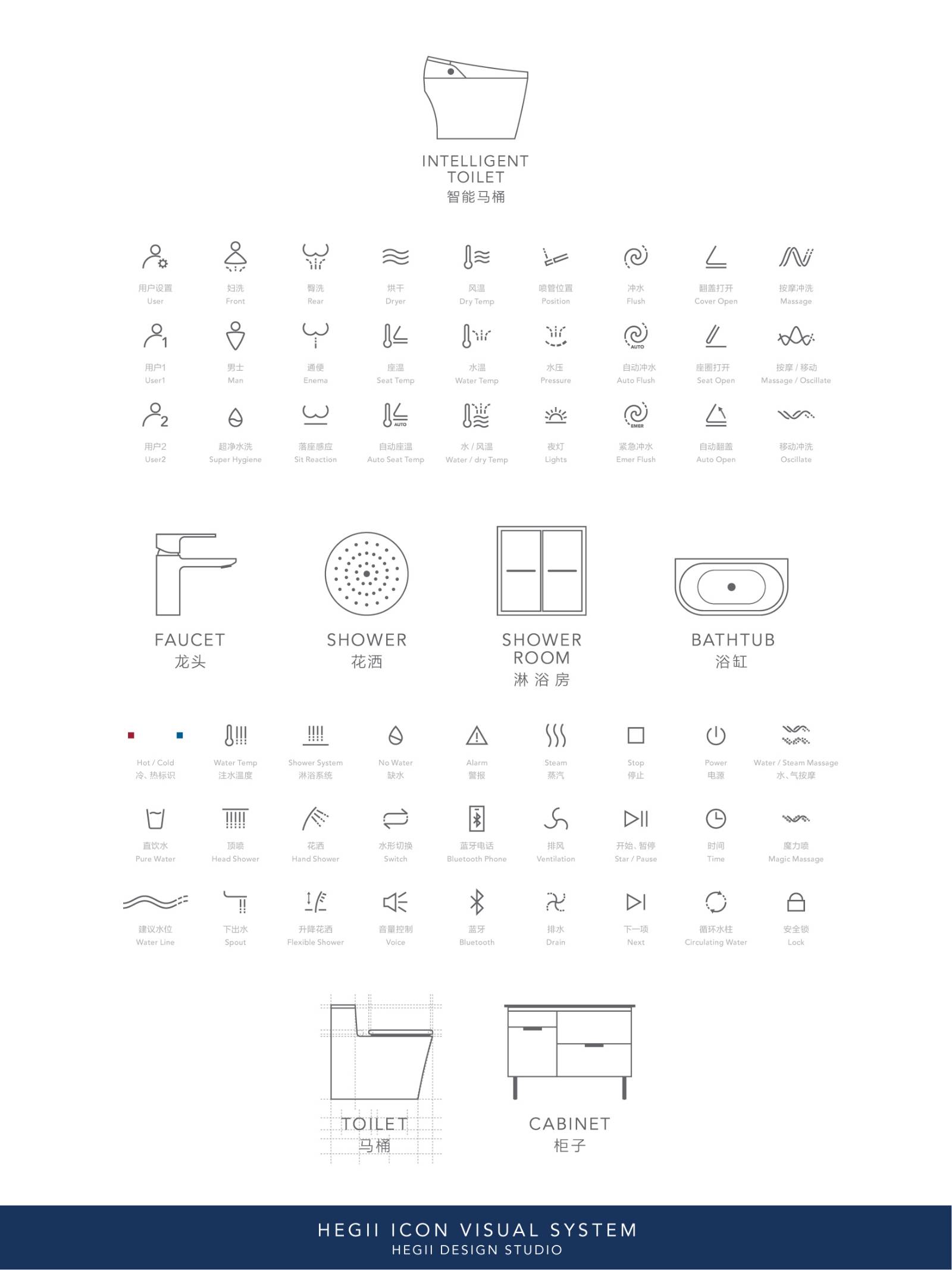
基于品牌产品种类的多元化和产品功能的多样化,新图标的设计是为了能正确的使用产品和快速认知产品的功能,并且提升良好的用户体验;恒洁卫浴标识视觉系统能有效地向消费者提供准确的引导和获取产品的功能信息。
用户价值
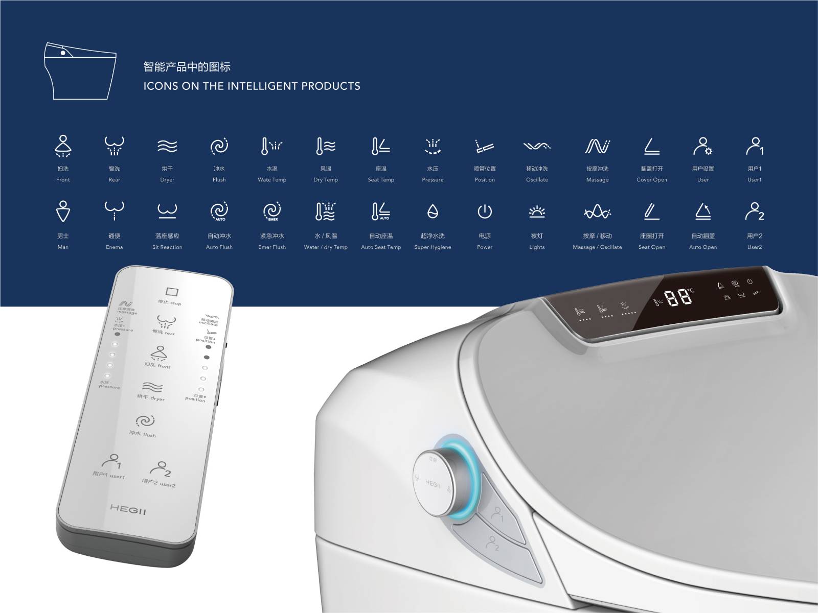
产品中的图标基于识别的准确性和设计语言的一致性开发与设计,出现在产品中有限的面积上和交互界面上,视觉上传递了产品的功能和意图。从功能的形态上提取和概括图形元素,保留一些具有传统意义和象征的标识符号,并在形态上加以规范;定义图标颜色和灯光的一致性,提供优良的用户交互和产品反馈。
图标库对用户的作用:为用户进行设计时,用户的使用环境和产品的使用场合需要被充分的考虑;视觉严谨的系统图标库,能引导用户对使用环境中的品牌产品有整体的理解和方便记忆的功能,保持设计语言的一致性非常重要。
商业表现
图标库在品牌中的作用:图标是强调功能性的,有助于品牌产品的内部管理和分类,视觉上辅助并配合品牌标志,完善整体的对外品牌形象。
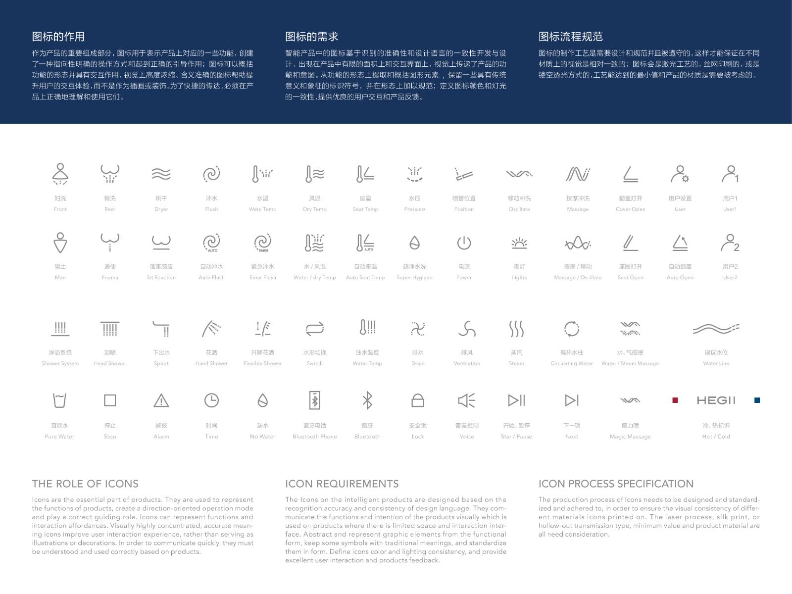
图标是产品的重要组成部分,它们用于表示产品上对应的一些功能,创建了一种指向性明确的操作方式和起到正确的引导作用;图标可以概括功能的形态并具有交互作用,视觉上高度浓缩、含义准确的图标帮助提升用户的交互体验,而不是作为插画或装饰。为了快捷的传达,必须在产品上正确地理解和使用它们。
社会影响
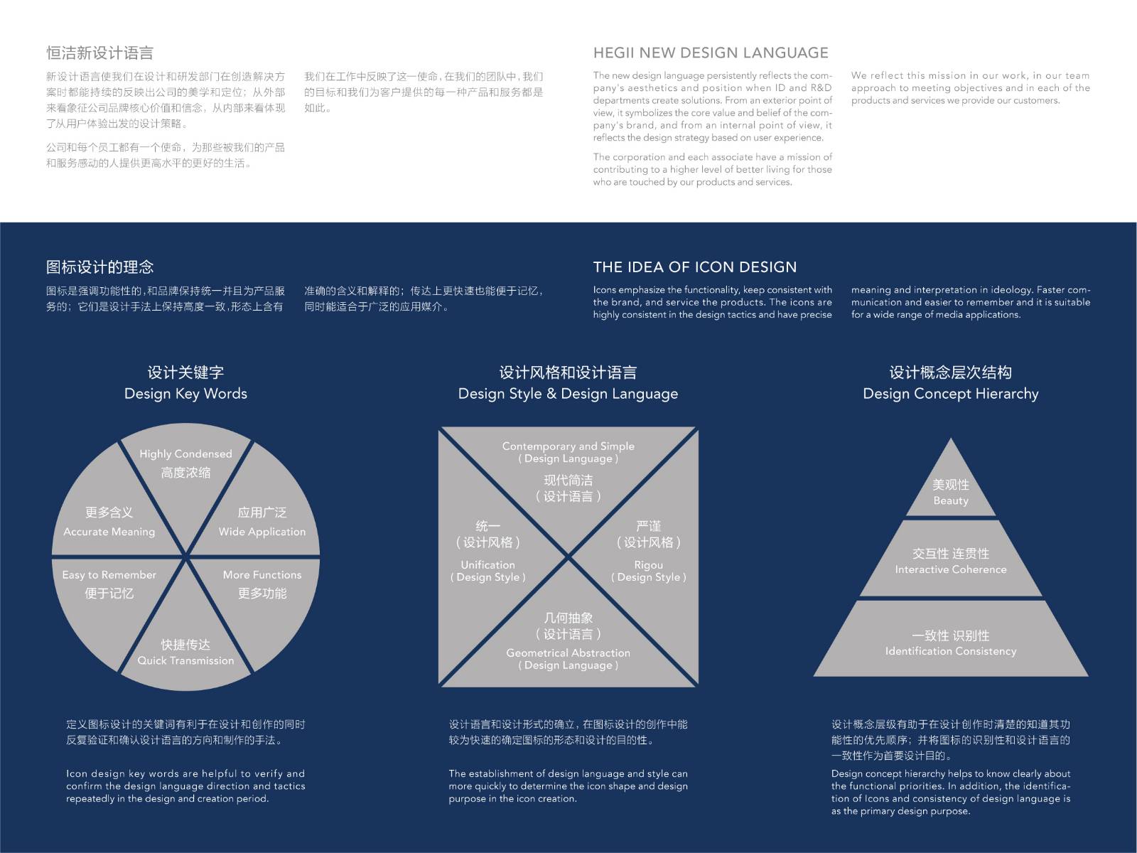
恒洁卫浴新设计语言使我们在设计和研发部门在创造解决方案时都能持续的反映出公司的美学和定位;从外部来看象征公司品牌核心价值和信念,从内部来看体现了从用户体验出发的设计策略。公司和每个员工都有一个使命,为那些被我们的产品和服务感动的人提供更高水平的更好的生活。我们在工作中反映了这一使命,在我们的团队中,我们的目标和我们为客户提供的每一种产品和服务都是如此。
流程方法
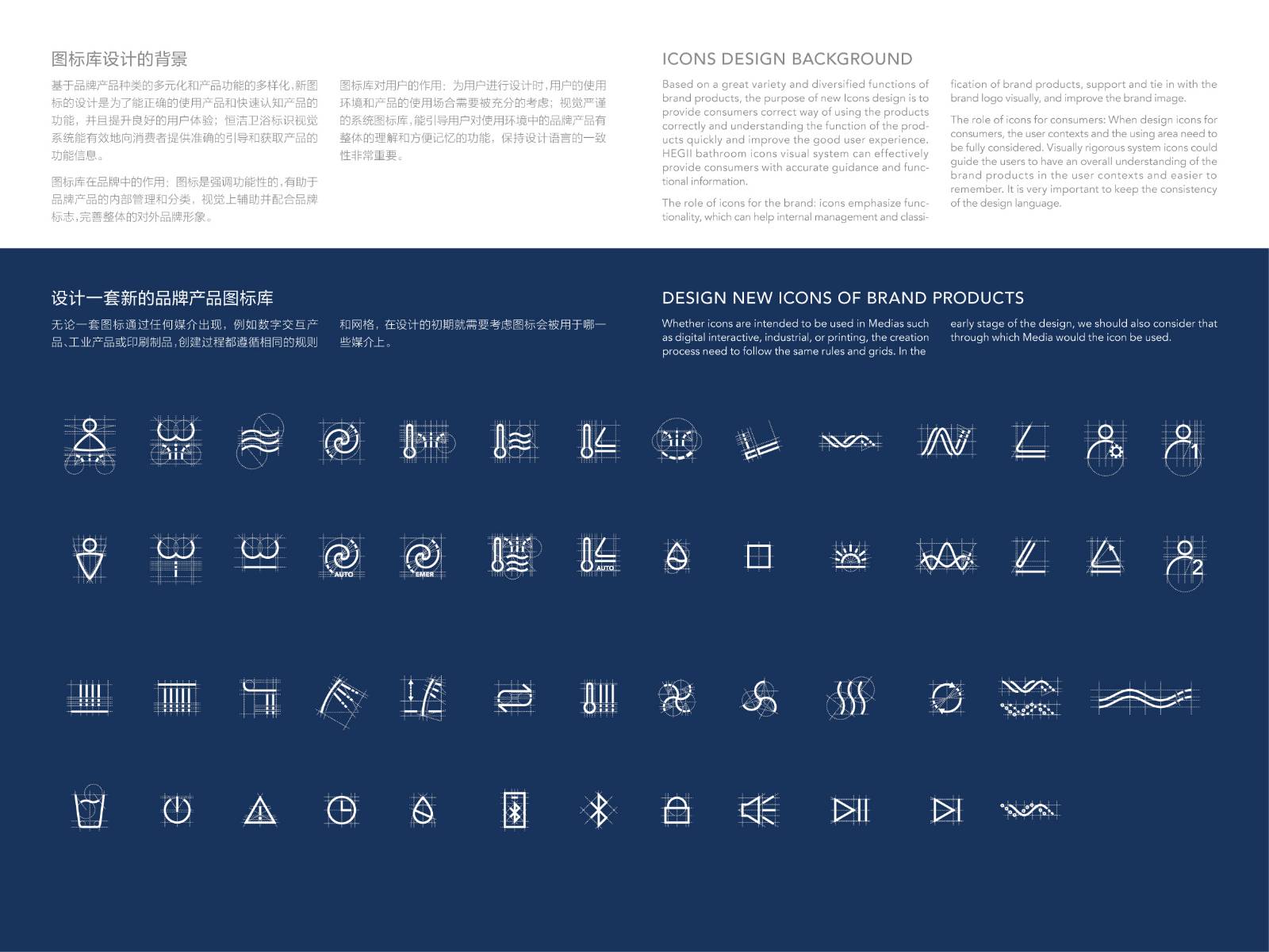
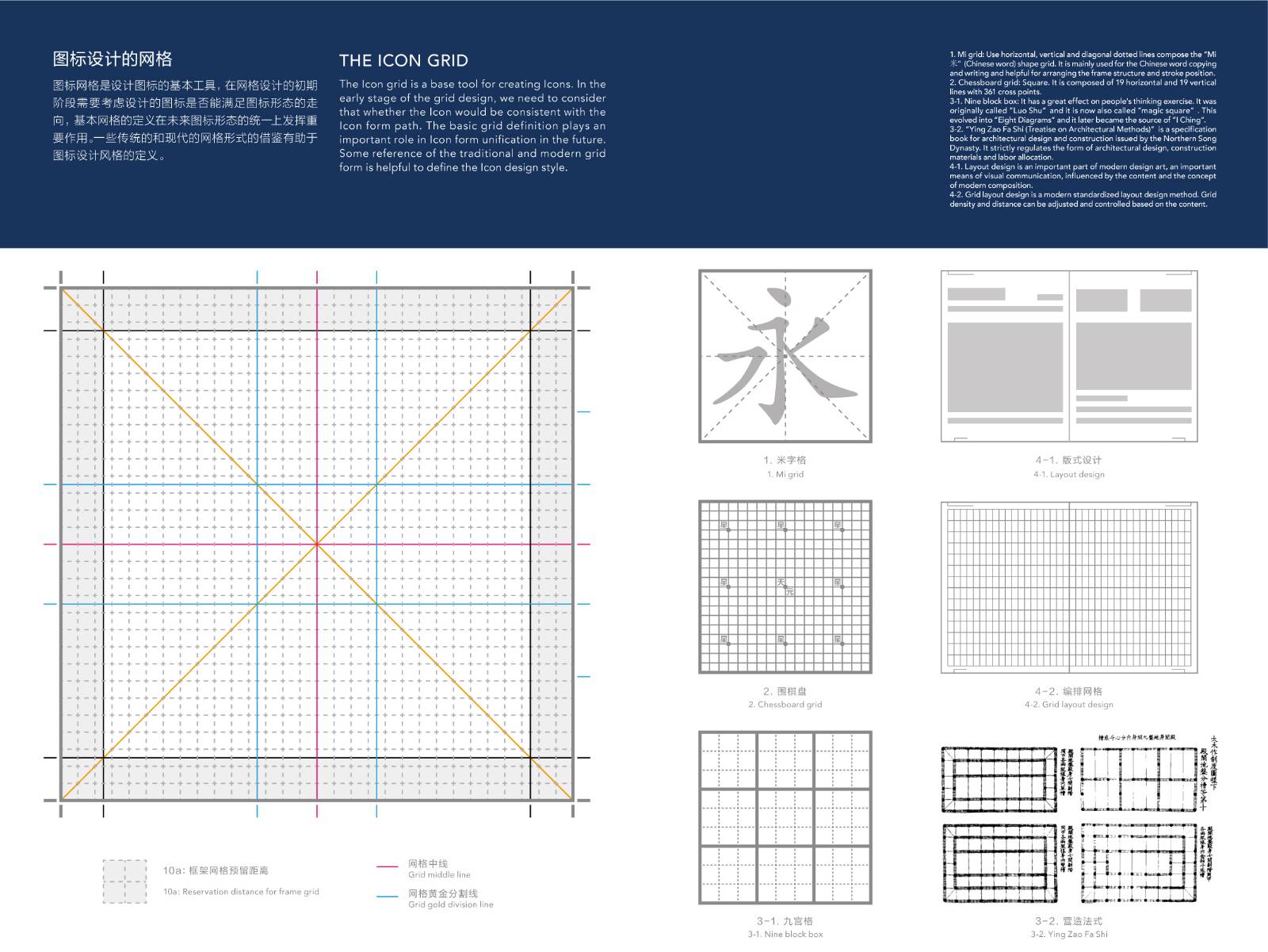
图标网格是设计图标的基本工具,在网格设计的初期阶段需要考虑设计的图标是否能满足图标形态的走向,基本网格的定义在未来图标形态的统一上发挥重要作用。一些传统的和现代的网格形式的借鉴有助于图标设计风格的定义。
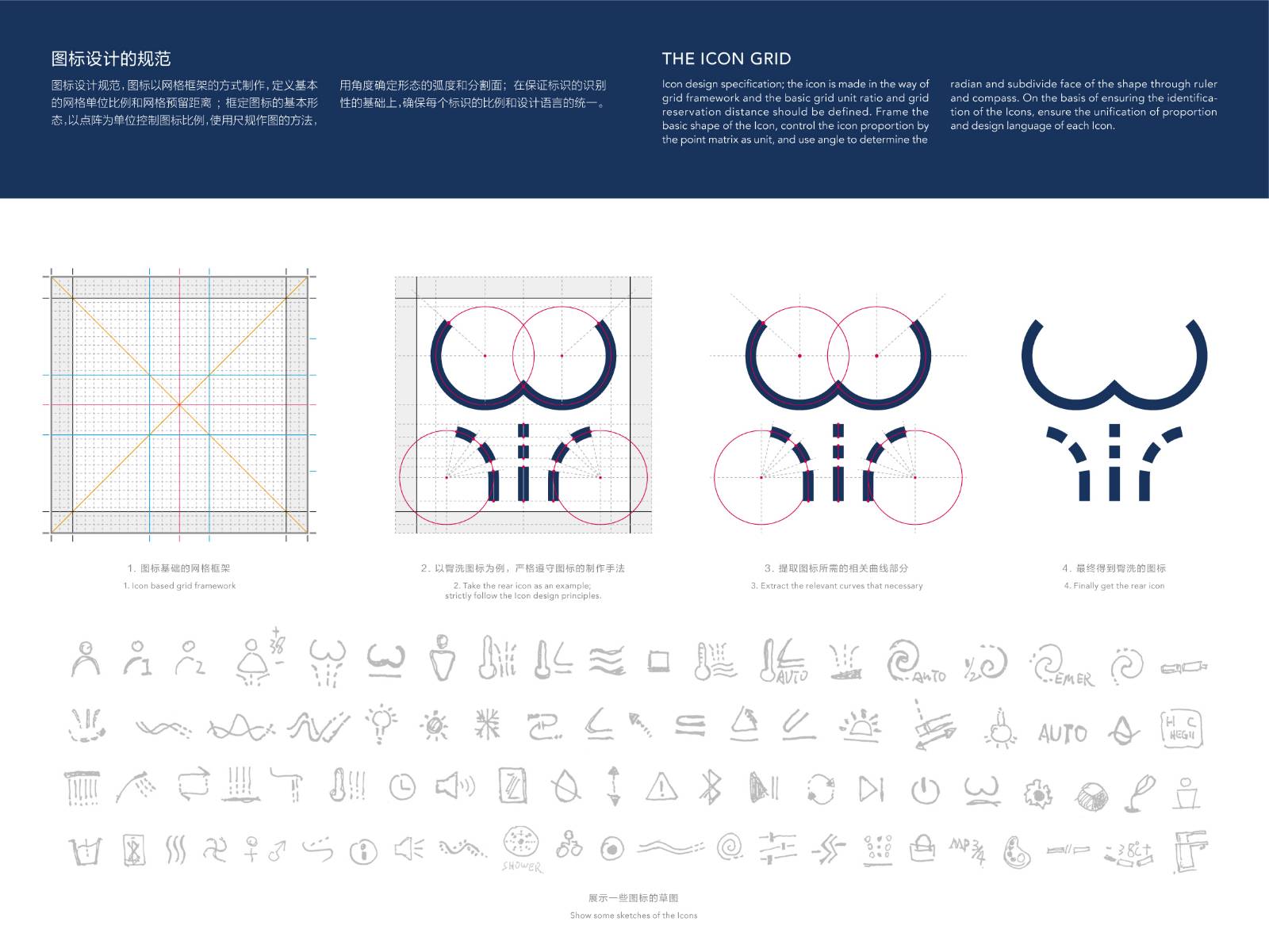
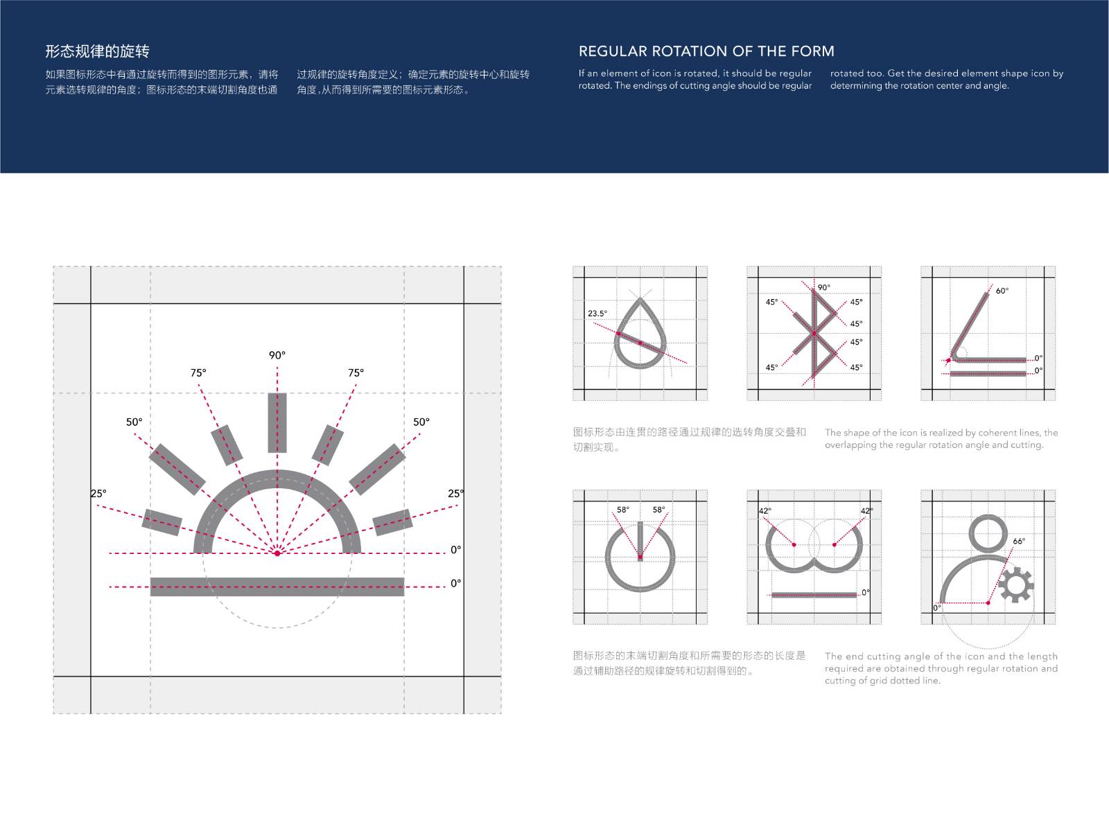
图标设计规范,图标以网格框架的方式制作,定义基本的网格单位比例和网格预留距离;框定图标的基本形态,以点阵为单位控制图标比例,使用尺规作图的方法,用角度确定形态的弧度和分割面;在保证标识的识别性的基础上,确保每个标识的比例和设计语言的统一。
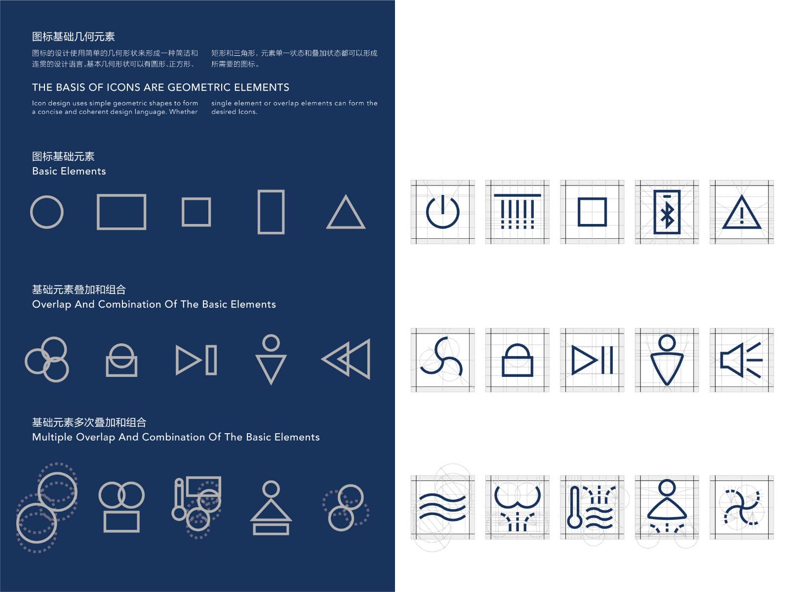
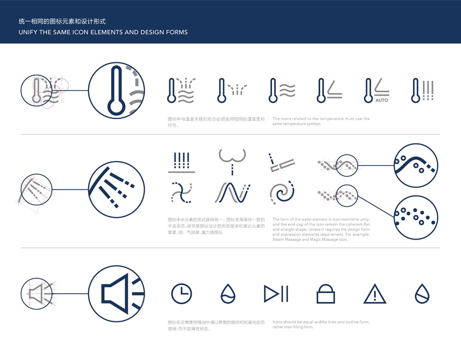
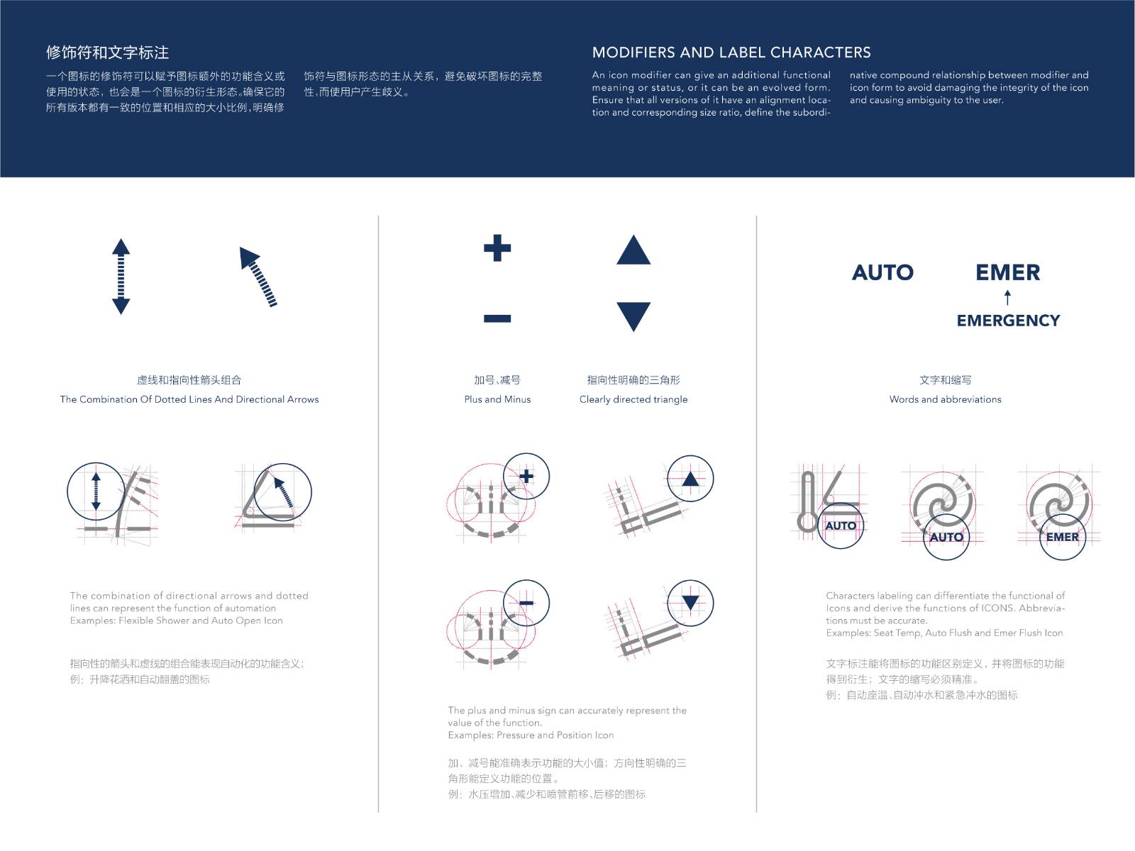
图标的设计使用简单的几何形状来形成一种简洁和连贯的设计语言。基本几何形状可以有圆形、正方形、矩形和三角形,元素单一状态和叠加状态都可以形成所需要的图标。
图标的制作工艺是需要设计和规范并且被遵守的,这样才能保证在不同材质上的视觉是相对一致的;图标会是激光工艺的,丝网印刷的,或是镂空透光方式的,工艺能达到的最小值和产品的材质是需要被考虑的。
达成情况
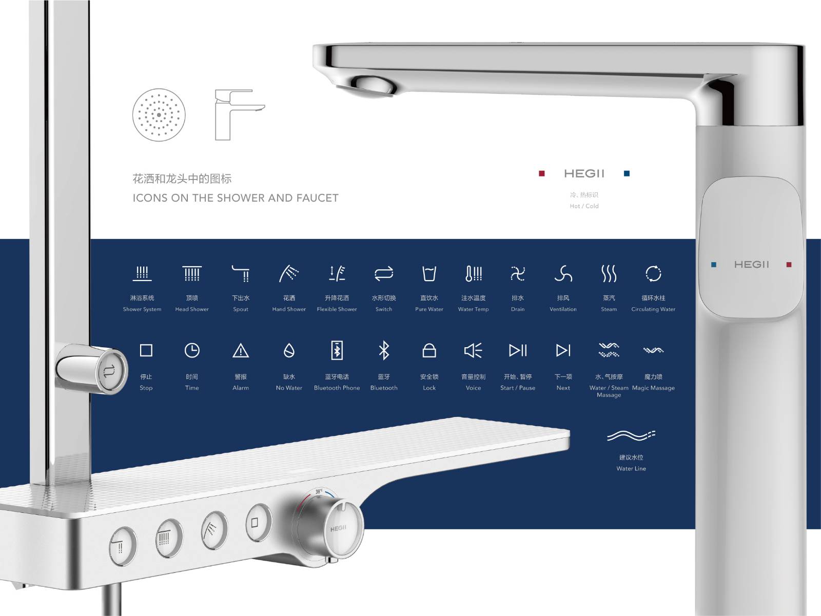
新图标库的设计应用基本已落实到品牌的各个产品中,统一更替了品牌产品上的所有功能图标,并配合品牌标志组成了整体的视觉语言。
Project Description
Based on a great variety and diversified functions of brand products, the purpose of new Icons design is to provide consumers correct way of using the products correctly and understanding the function of the products quickly and improve the good user experience. HEGII bathroom icons visual system can effectively provide consumers with accurate guidance and functional information.
User Value
The Icons on the intelligent products are designed based on the recognition accuracy and consistency of design language. They communicate the functions and intention of the products visually which is used on products where there is limited space and interaction interface. Abstract and represent graphic elements from the functional form, keep some symbols with traditional meanings, and standardize them in form. Define icons color and lighting consistency, and provide excellent user interaction and products feedback.
The role of icons for consumers: When design icons for consumers, the user contexts and the using area need to be fully considered. Visually rigorous system icons could guide the users to have an overall understanding of the brand products in the user contexts and easier to remember. It is very important to keep the consistency of the design language.
Business Performance
The role of icons for the brand: icons emphasize functionality, which can help internal management and classification of brand products, support and tie in with the brand logo visually, and improve the brand image.
Icons are the essential part of products. They are used to represent the functions of products, create a direction-oriented operation mode and play a correct guiding role. Icons can represent functions and interaction affordances. Visually highly concentrated, accurate meaning icons improve user interaction experience, rather than serving as illustrations or decorations. In order to communicate quickly, they must be understood and used correctly based on products.
Social Impact
The new design language persistently reflects the company's aesthetics and position when ID and R&D departments create solutions. From an exterior point of view, it symbolizes the core value and belief of the company's brand, and from an internal point of view, it reflects the design strategy based on user experience.
The corporation and each associate have a mission of contributing to a higher level of better living for those who are touched by our products and services.
We reflect this mission in our work, in our team approach to meeting objectives and in each of the products and services we provide our customers.
Flow
The Icon grid is a base tool for creating Icons. In the early stage of the grid design, we need to consider that whether the Icon would be consistent with the Icon form path. The basic grid definition plays an important role in Icon form unification in the future. Some reference of the traditional and modern grid form is helpful to define the Icon design style.
Icon design specification; the icon is made in the way of grid framework and the basic grid unit ratio and grid reservation distance should be defined. Frame the basic shape of the Icon, control the icon proportion by the point matrix as unit, and use angle to determine the radian and subdivide face of the shape through ruler and compass. On the basis of ensuring the identification of the Icons, ensure the unification of proportion and design language of each Icon.
Icon design uses simple geometric shapes to form a concise and coherent design language. Whether single element or overlap elements can form the desired Icons.
The production process of Icons needs to be designed and standardized and adhered to, in order to ensure the visual consistency of different materials icons printed on. The laser process, silk print, or hollow-out transmission type, minimum value and product material are all need consideration.
Project Investment
It will take about one year for the project to reach the phased goals.
Project Achievements
The design and application of the new icon library have been basically implemented in all the products of the brand, and all the functional ICONS on the brand products have been replaced and integrated with the brand logo to form the overall visual language.





用户名
{{ item.email }} {{ moment(item.meta.createAt).format('YYYY-MM-DD HH:mm:ss') }}
回复:{{ item.mentioned }} {{ item.content }}
回复