Project Description
As a brand leader in natural dietetic grain business, WU GU MO FANG has established more than two thousand stores in around two hundred cities nationally. In 2014, it won the title of “Citizen’s Most Favorite Fast Moving Consumer Good.”
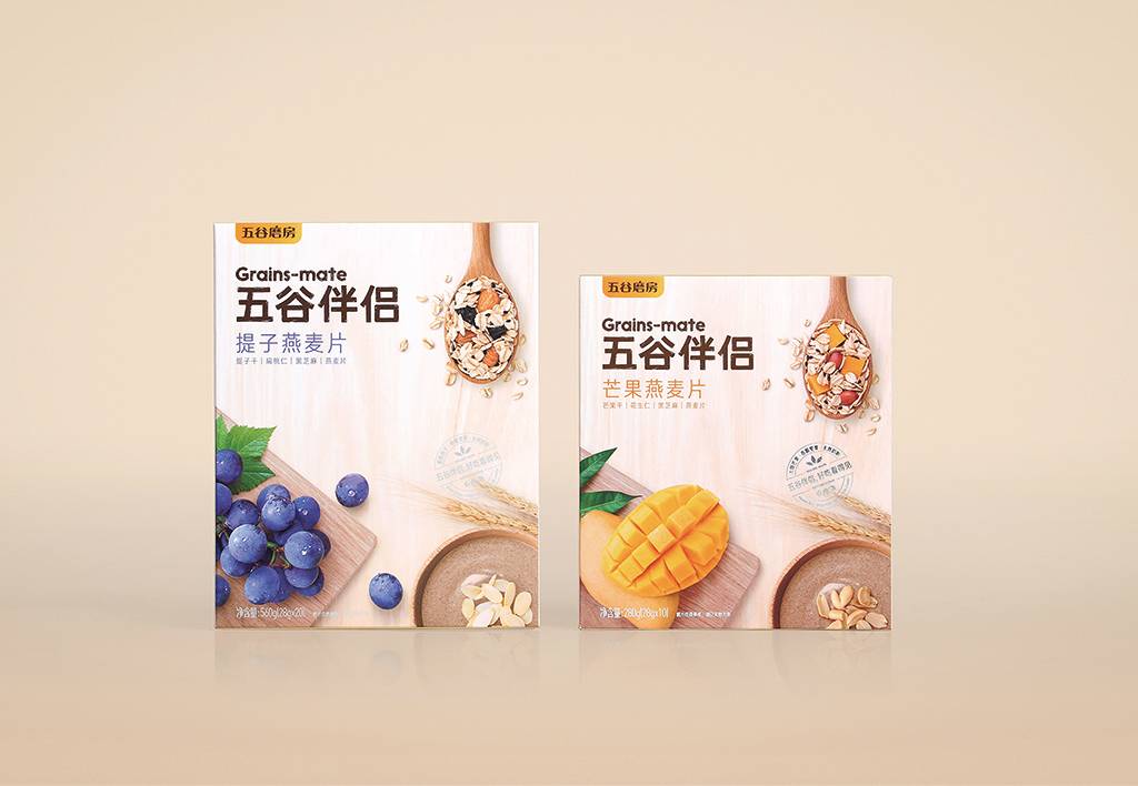
Due to the weak brand characteristics and the unclear visual communication, the brand lacks its unique quality. Therefore, in order to better communicate with the consumers, to increase the brand attraction, to deliver the brand value of health, nature, honesty and care, a new brand image and a series of packaging designs are needed to inherit the ideas behind.
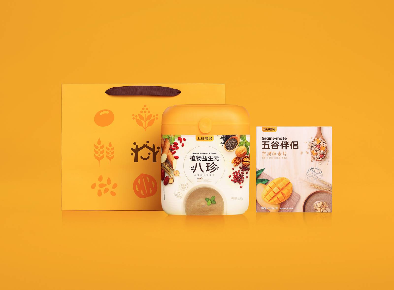
To overcome the challenges that the current brand image faces, the new logo is concise, welcoming and approachable, combining an icon and Chinese characters. The brand image consists of five seeds of grain and a smiling face embraced by two branches, as if parents hold up a joyful house for the family. It delivers a branding vision of love and care, implying the continuous growth of the company and the management philosophy of “human-oriented.”
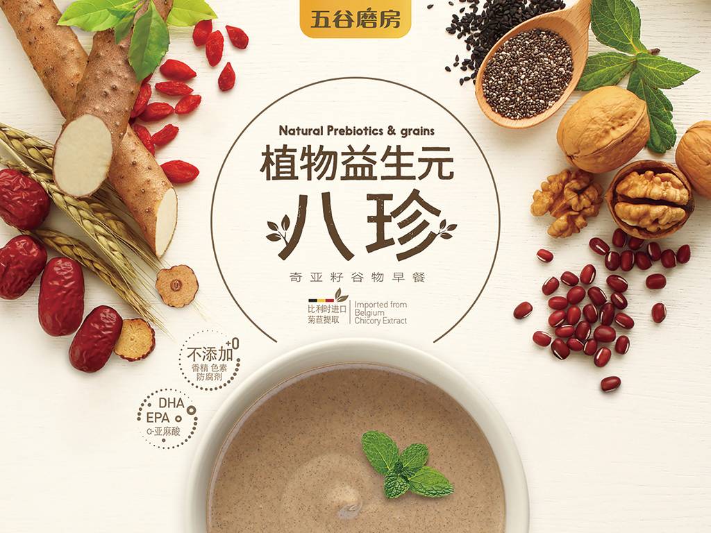
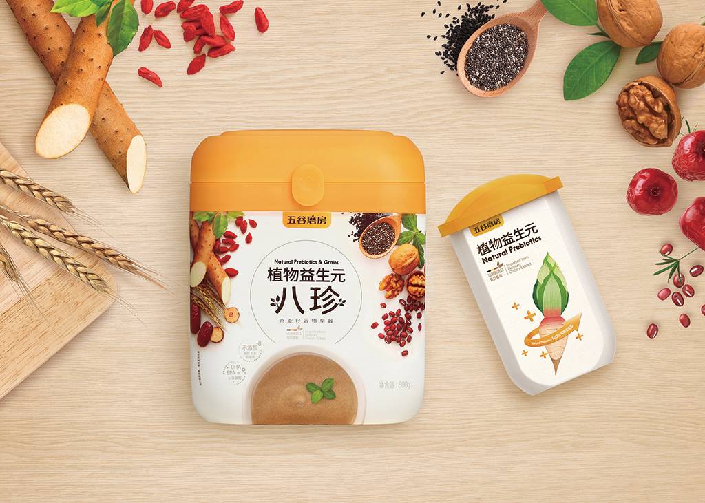
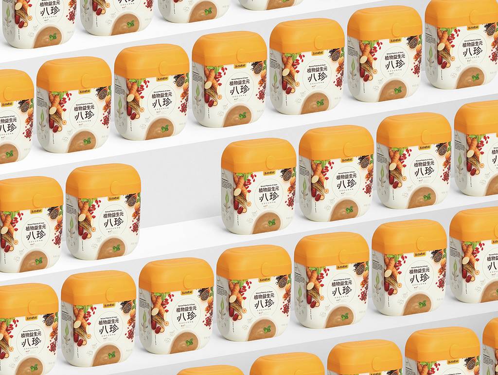
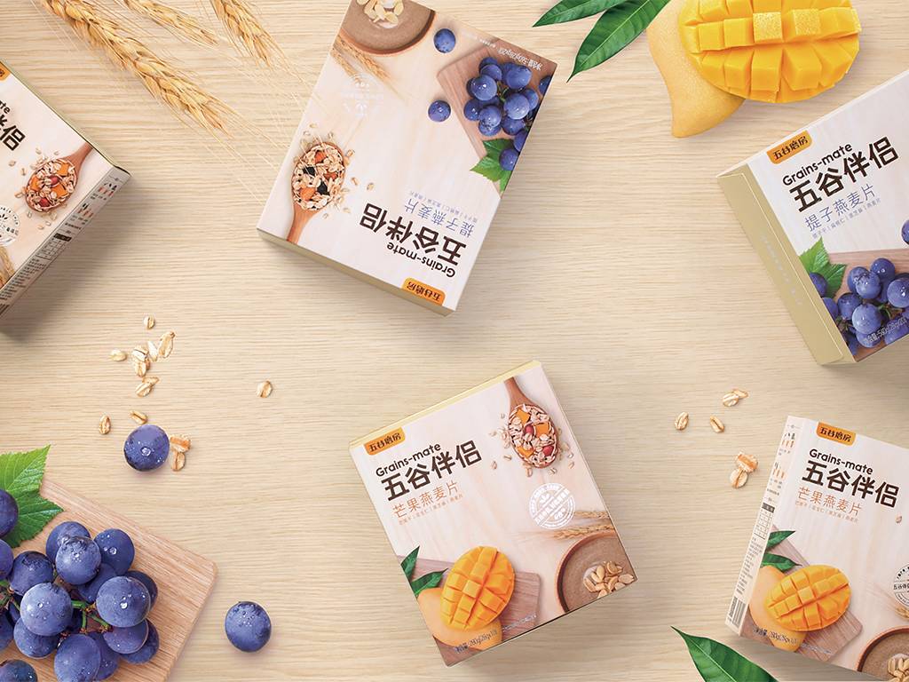
Along with the upgrade of the brand image, the star product of WU GU MO FANG - Yi Yuan Ba Zhen - improves its version, renamed “Natural Prebiotics & Grains.” To better incorporate the design with the concept of “Nature, Health, Nutrients and the Variety of Product Ingredients,” the packaging makes use of the five natural grain ingredients, together with the ecological color of green. The packaging shows a vision of freshness and nature. Comparing to the neighboring goods on the product shelf, the packaging color stands out and the brand tonality is fully expressed. After “Natural Prebiotics & Grains” came into market with its new packaging, the monthly sales reached 30 million RMB, and won unanimous praise.






用户名
{{ item.email }} {{ moment(item.meta.createAt).format('YYYY-MM-DD HH:mm:ss') }}
回复:{{ item.mentioned }} {{ item.content }}
回复