Project Description
Chuange is a well-known restaurant brand from Qingdao, widely recognized for its Spanish mackerel dumplings and regarded as a pioneer of the fish dumpling category. Rooted in Jiaodong seafood cuisine, the brand combines culinary heritage with innovation and aims to translate Qingdao’s ocean culture into a distinctive dining experience.
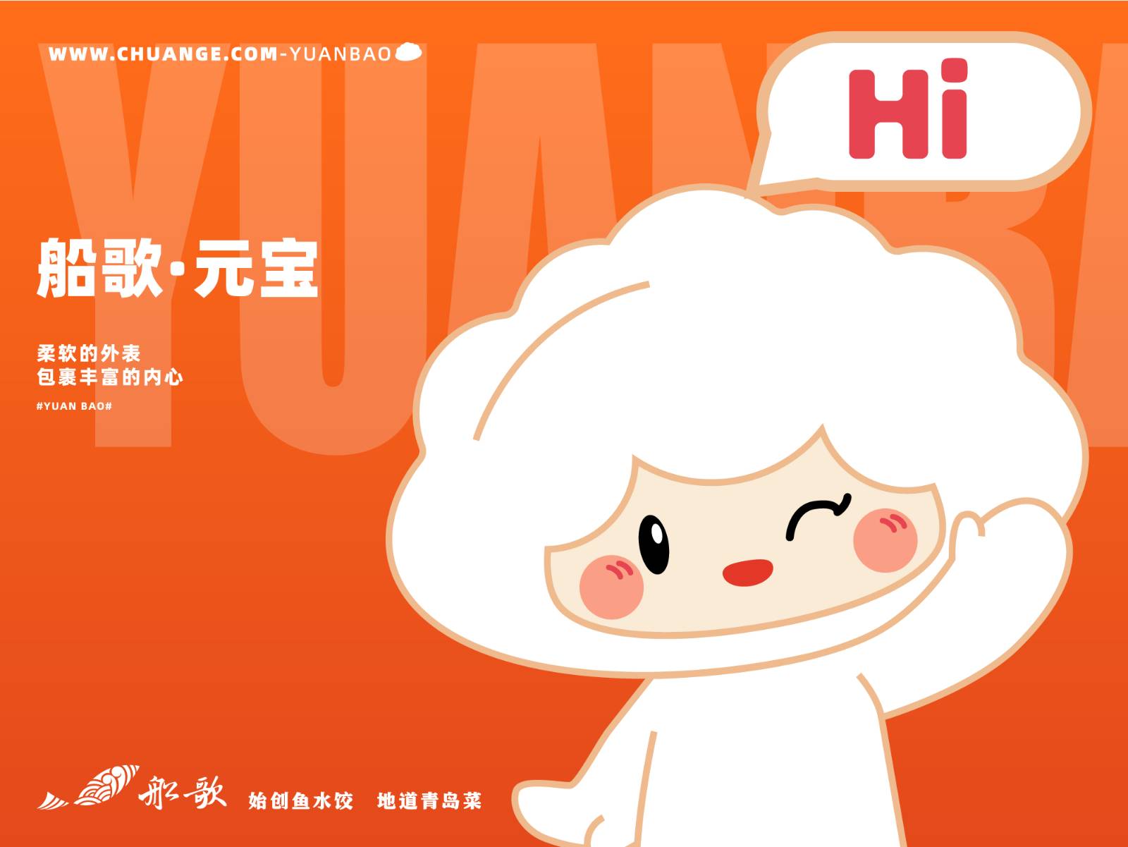
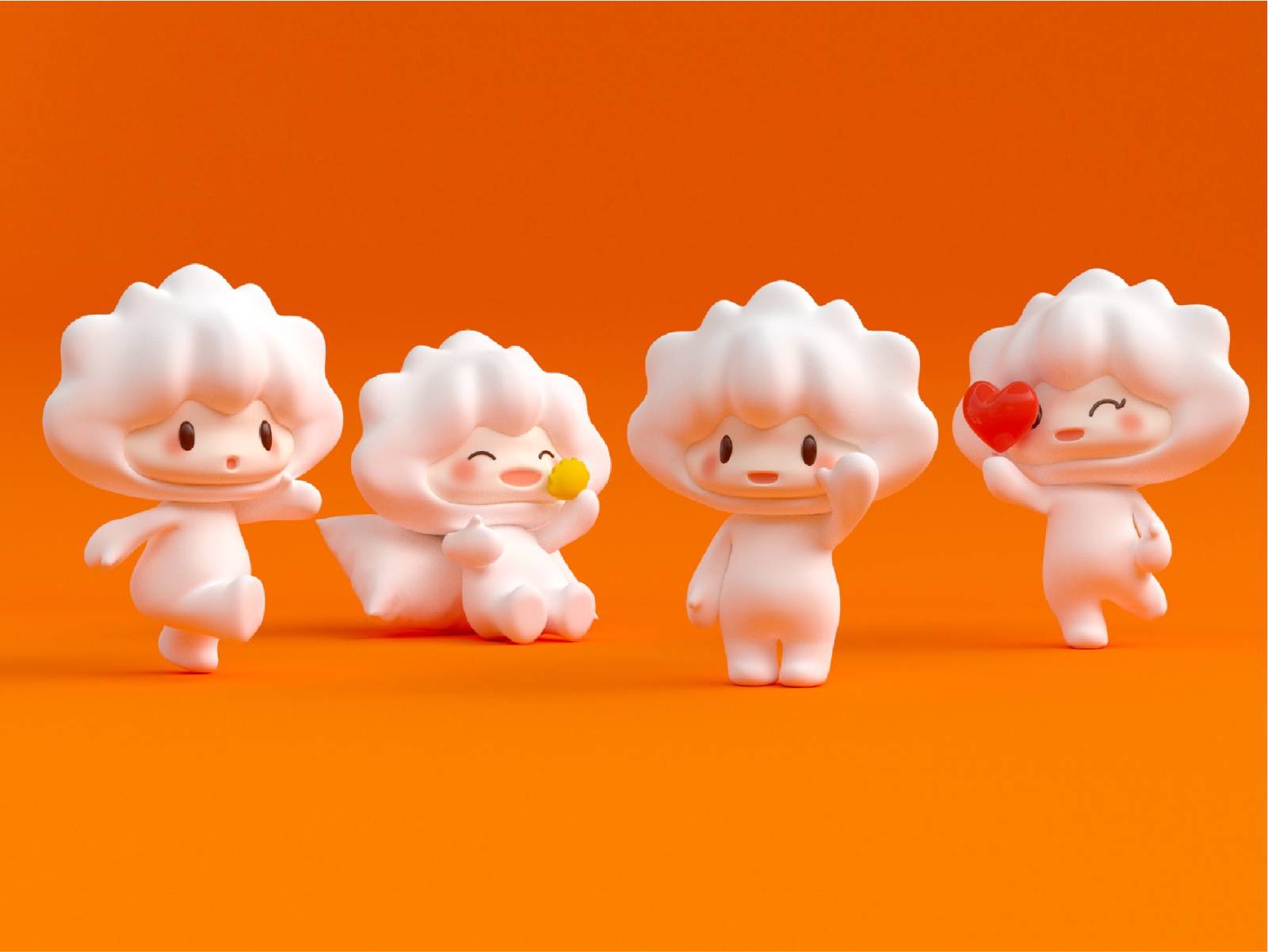
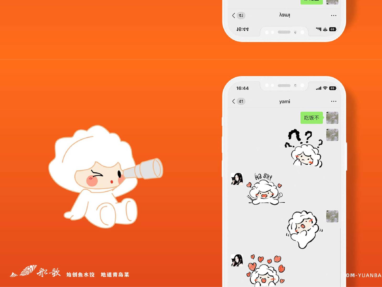
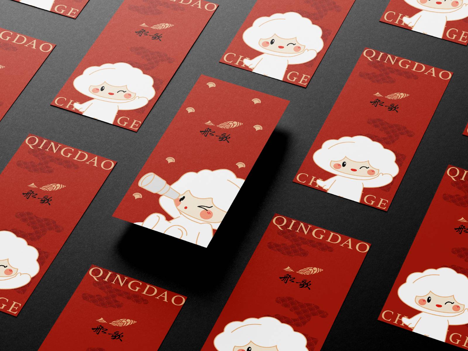
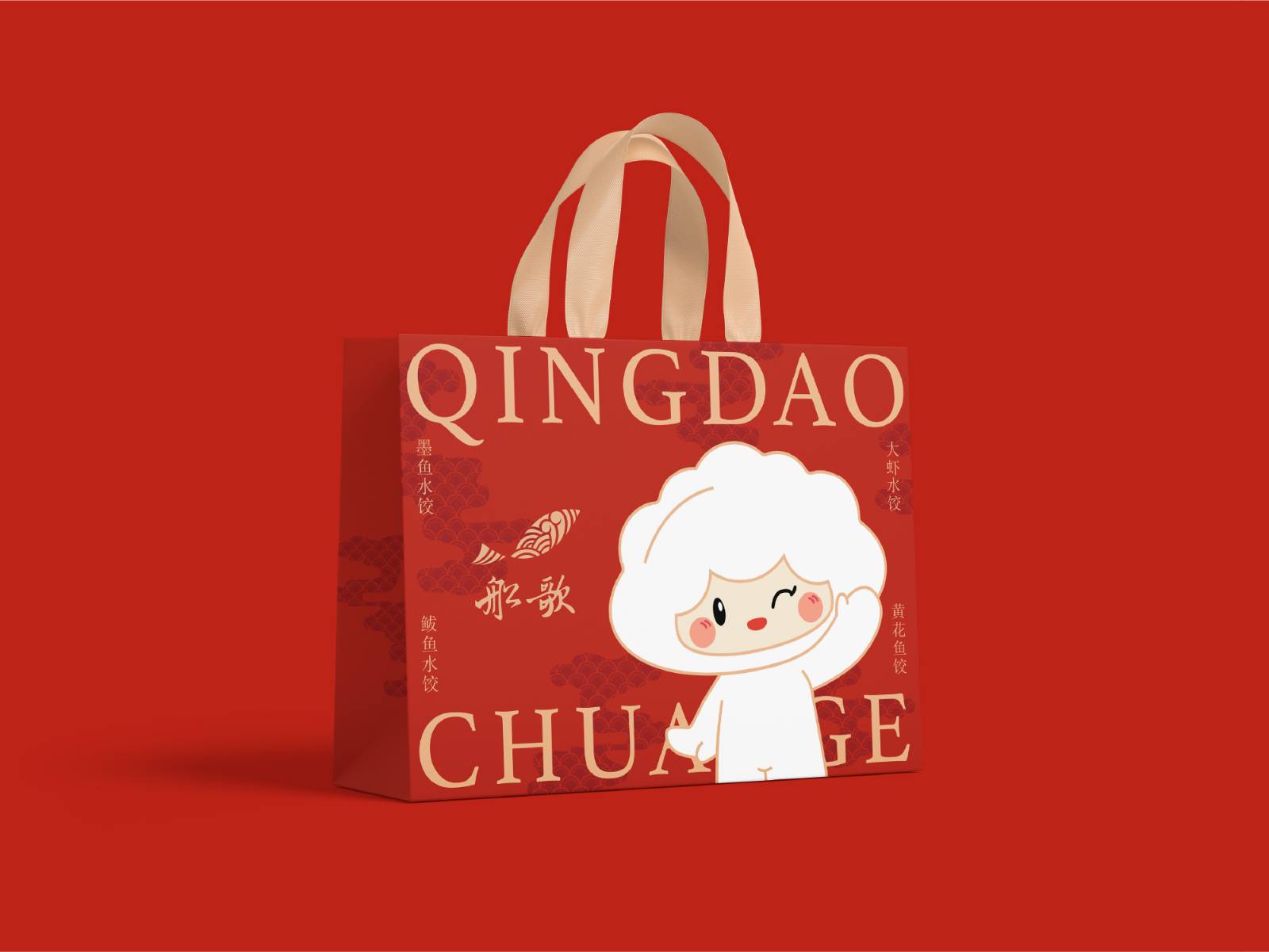
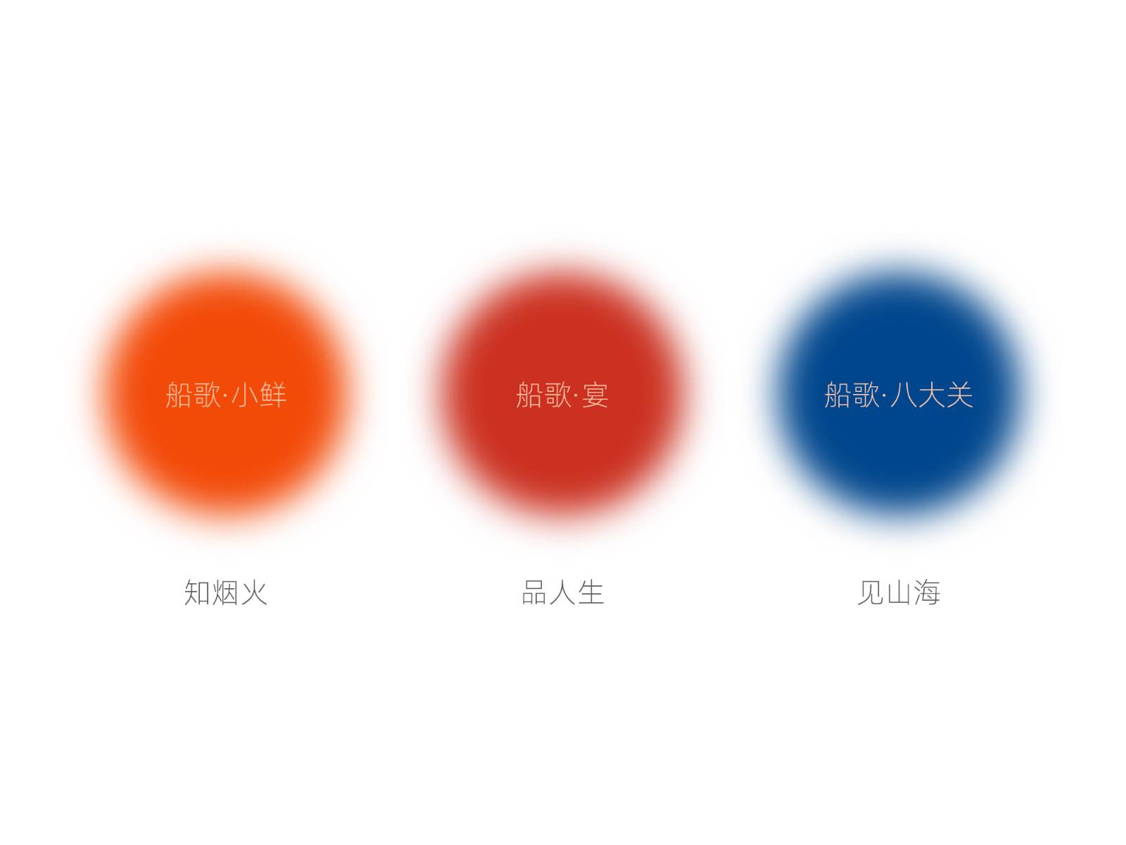
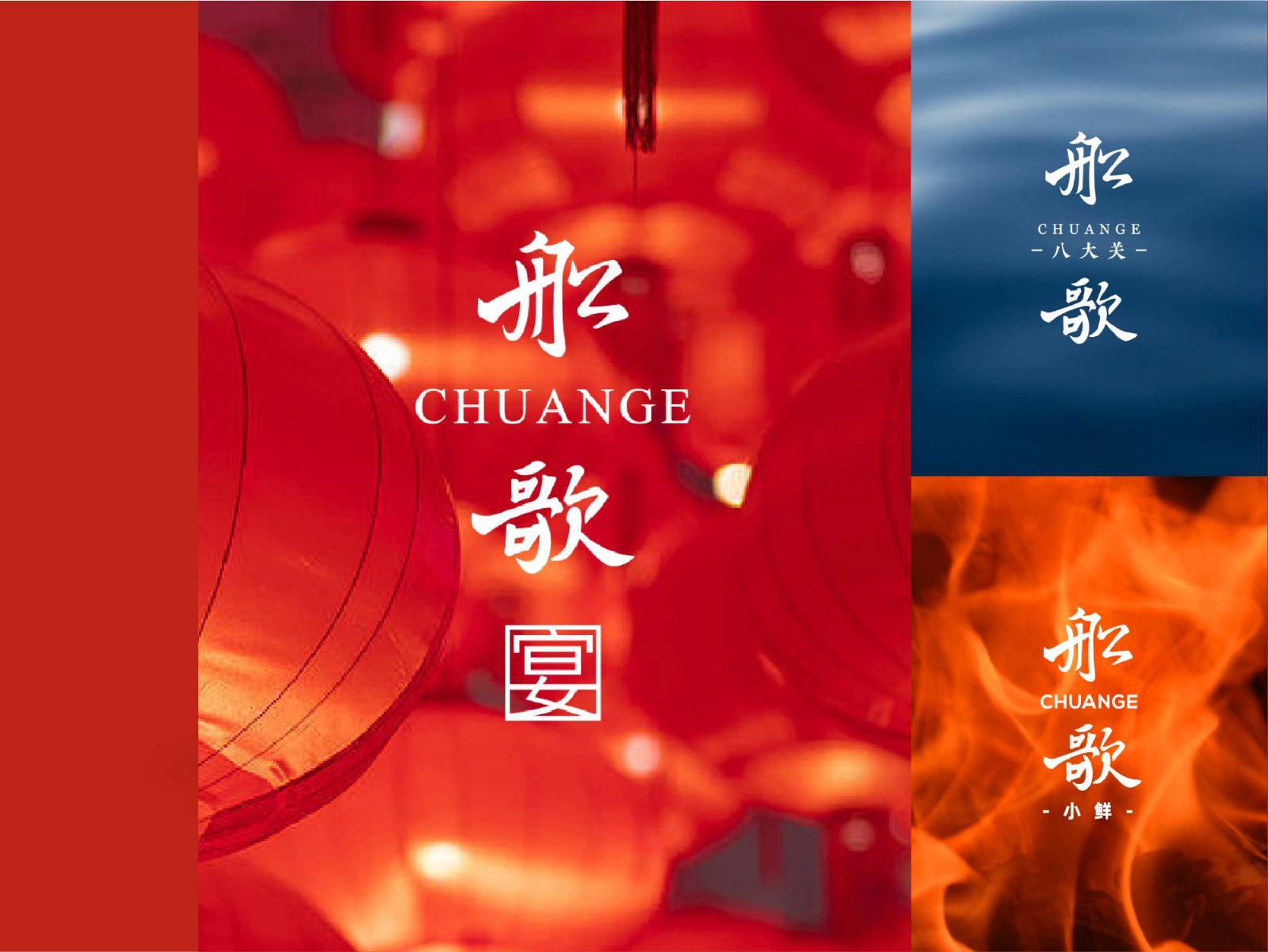
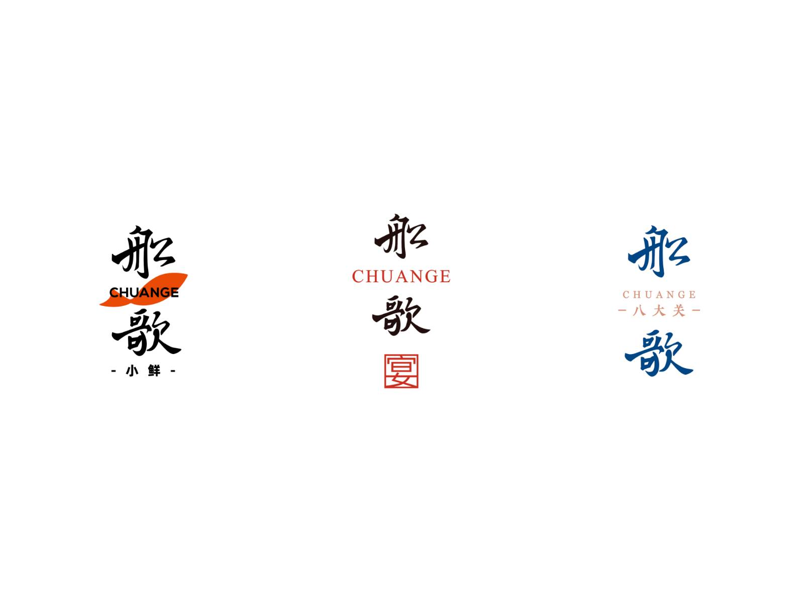
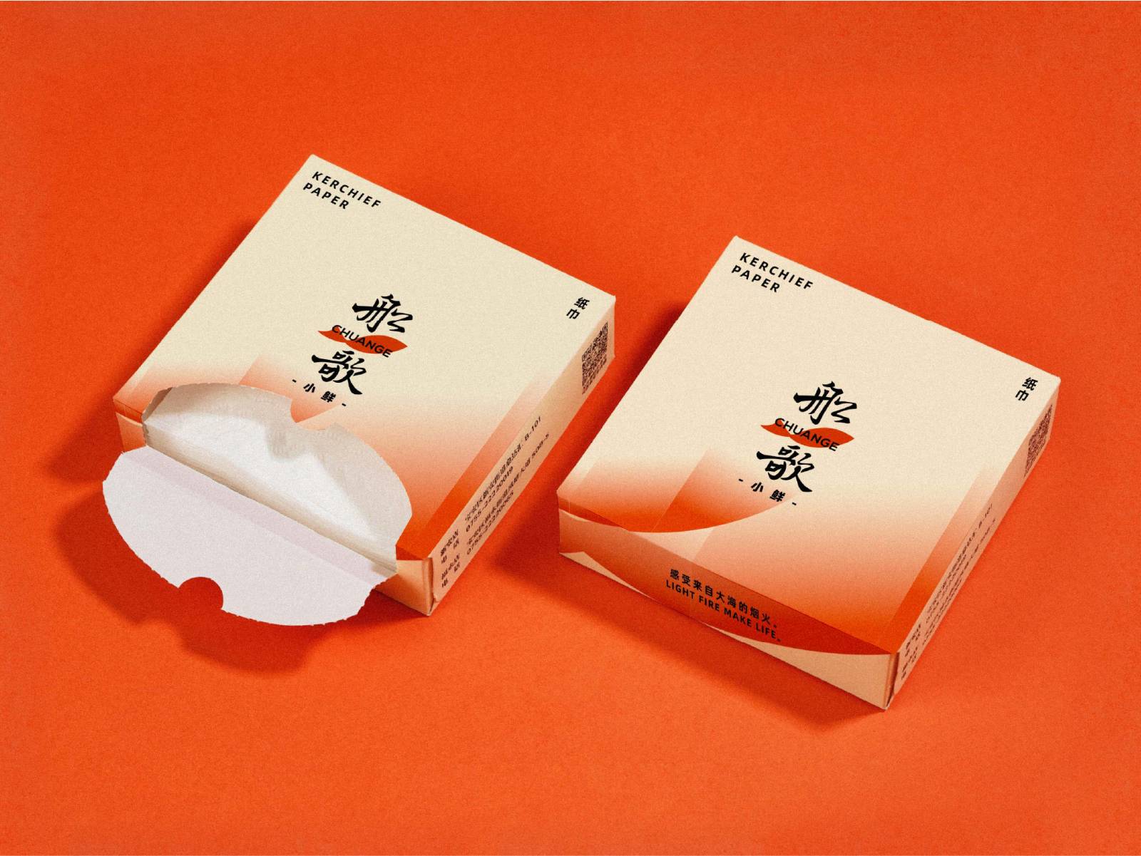
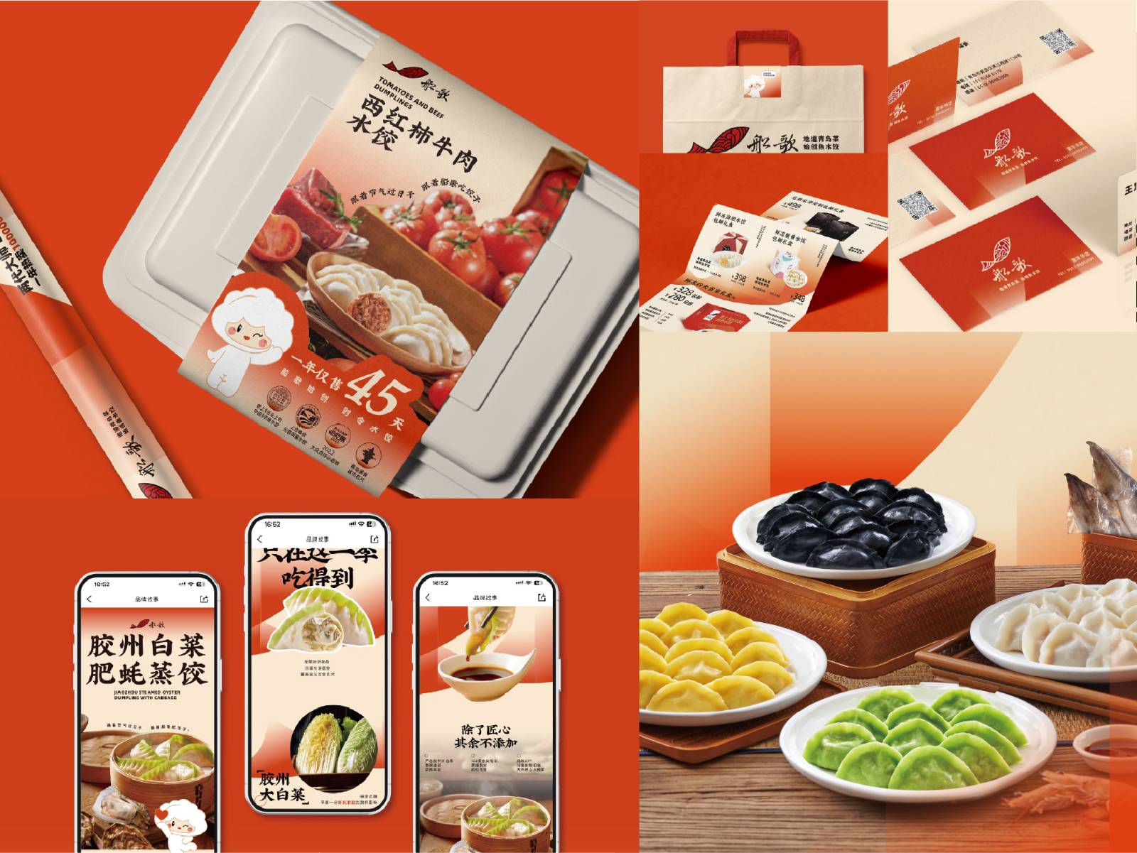
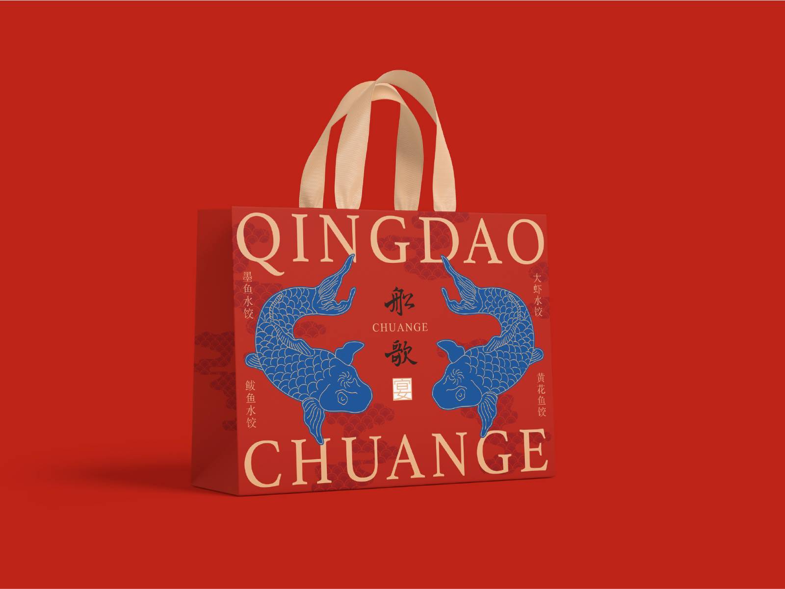
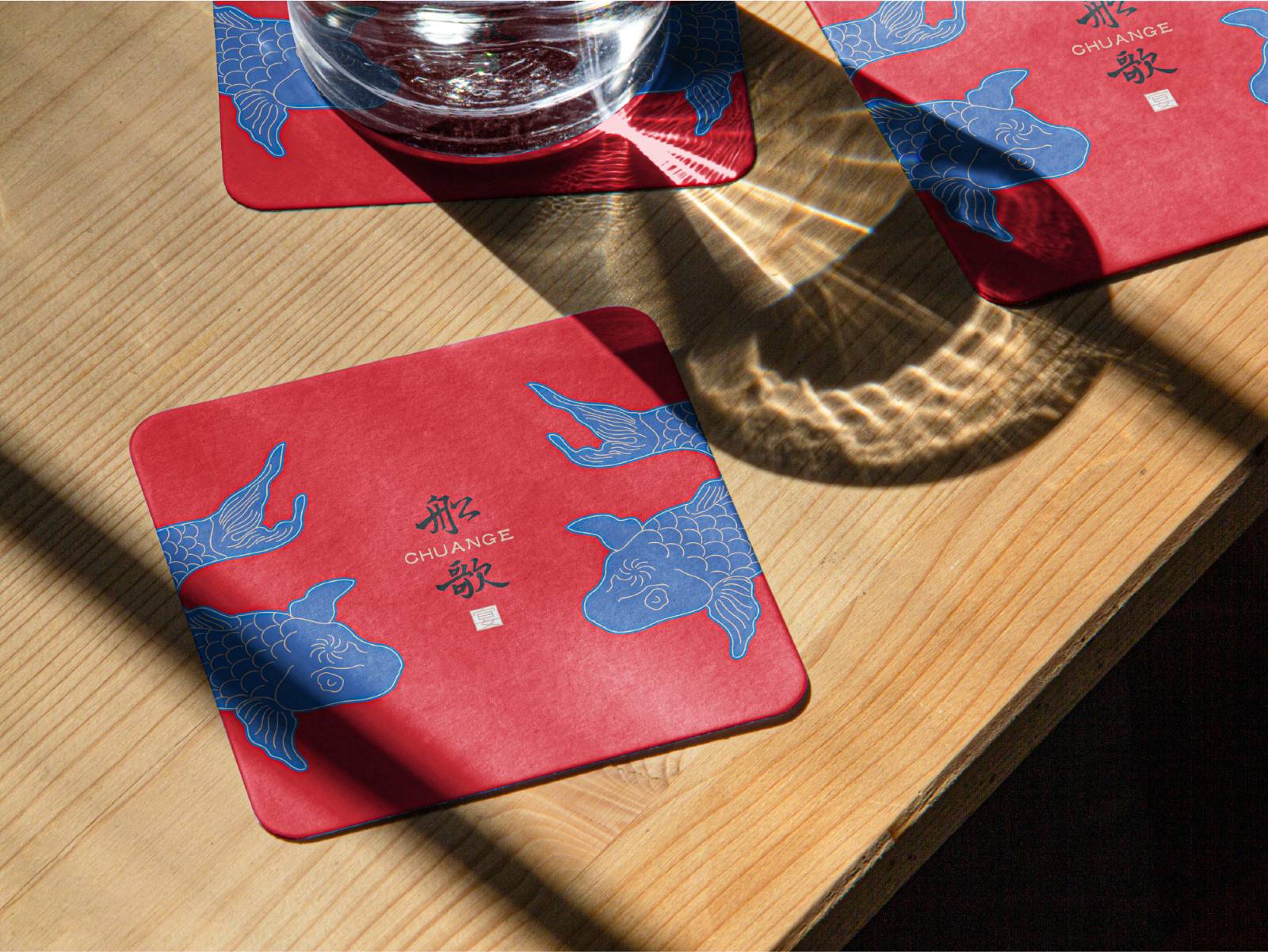
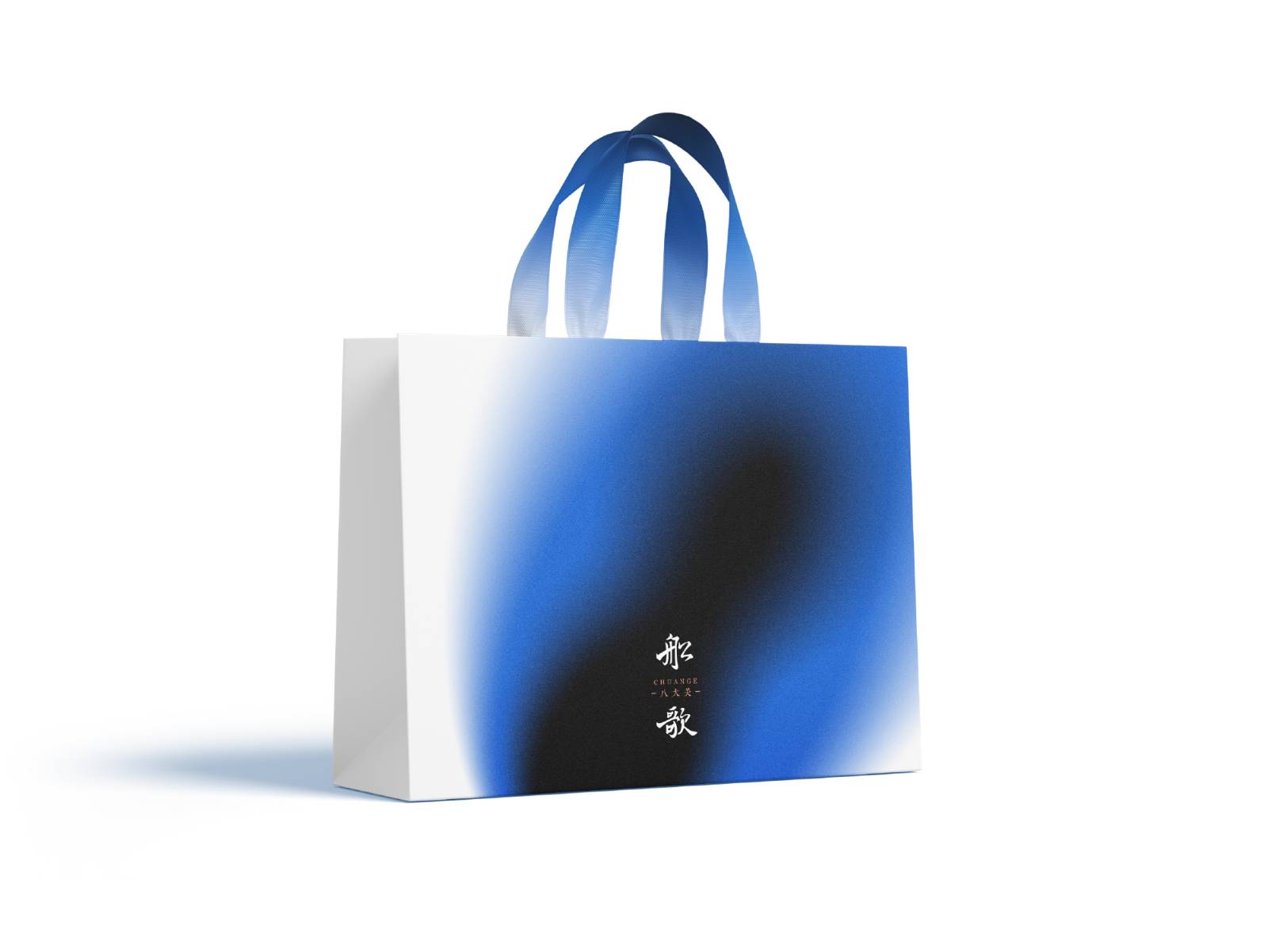
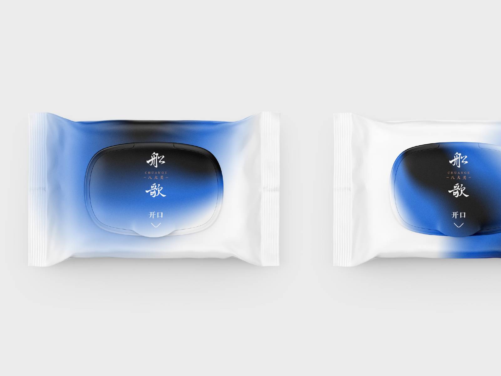
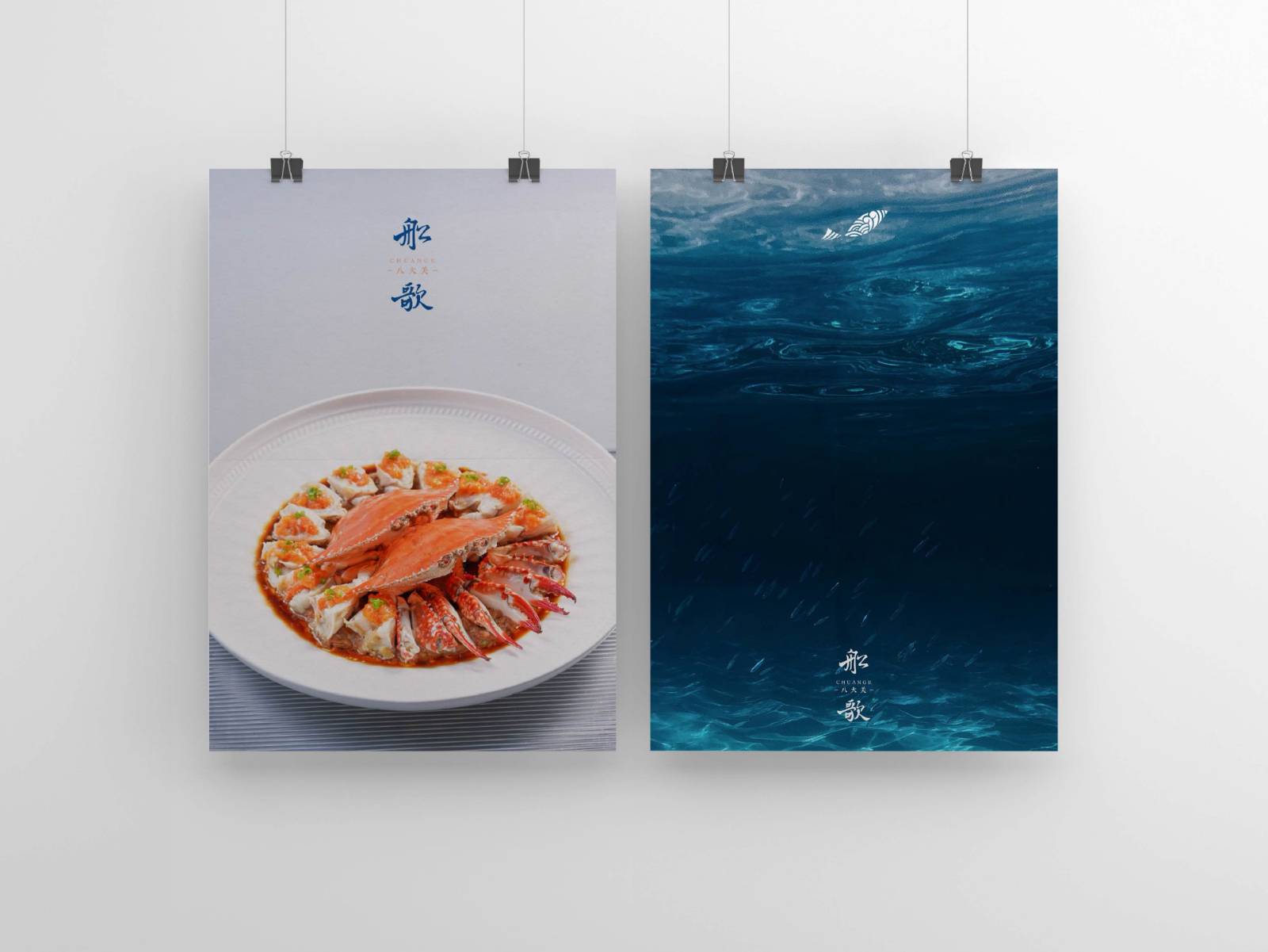
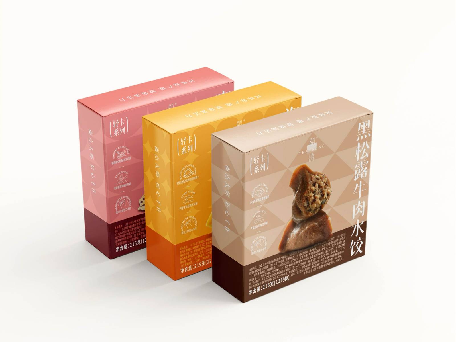
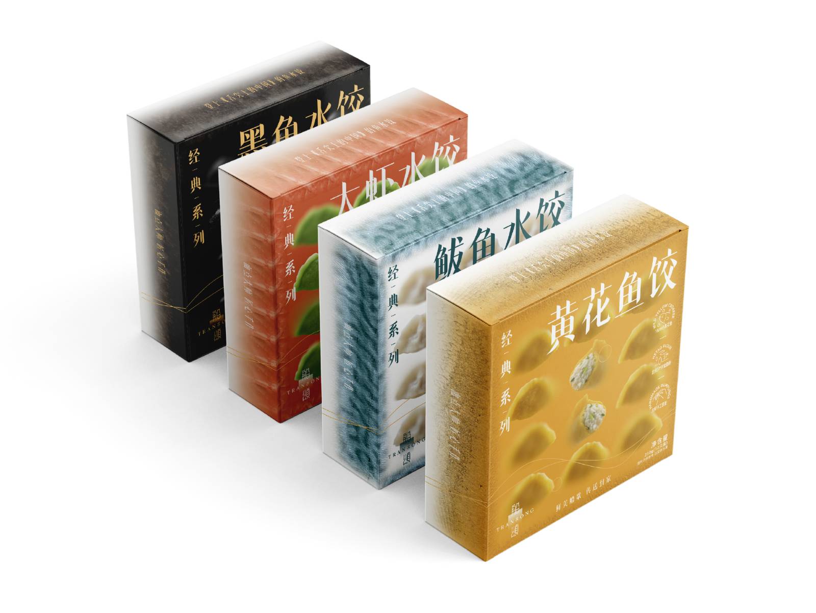
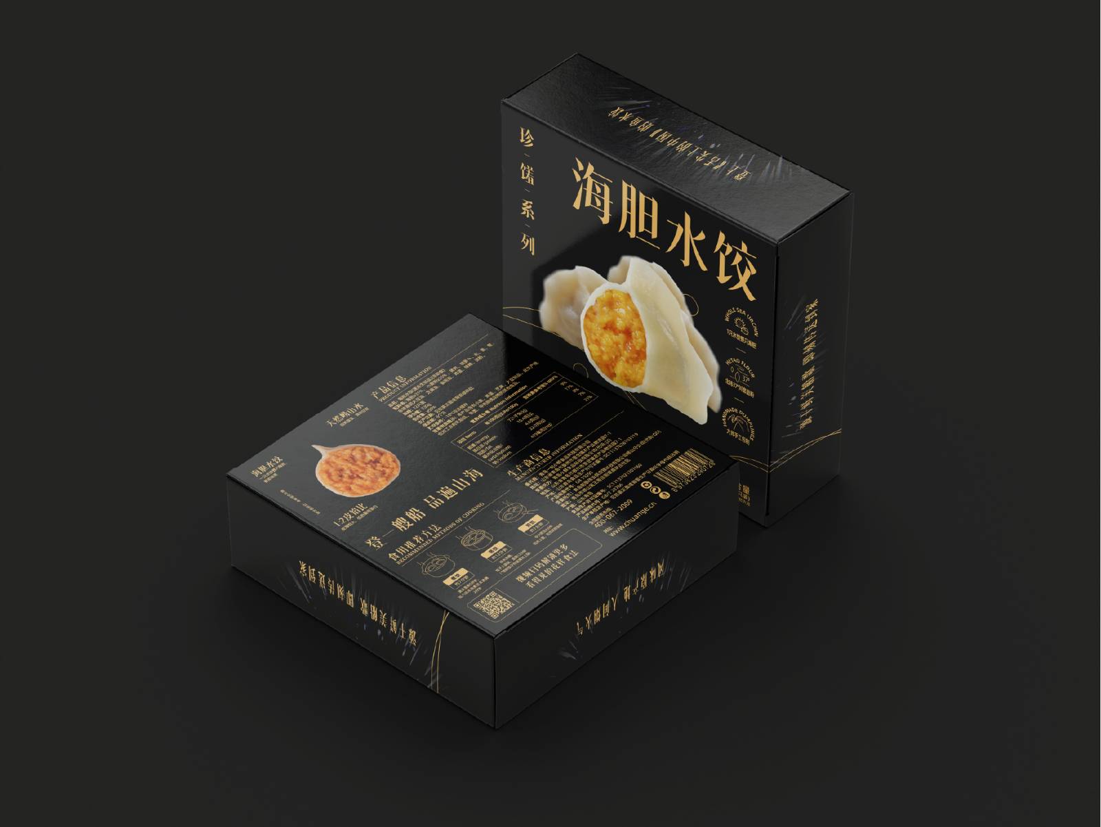
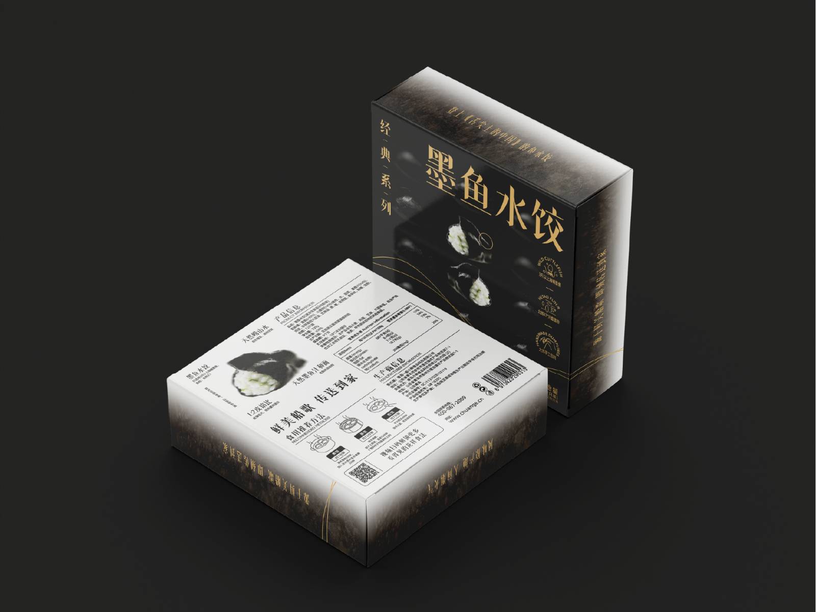
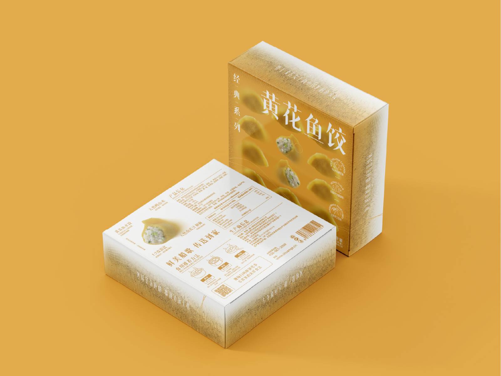
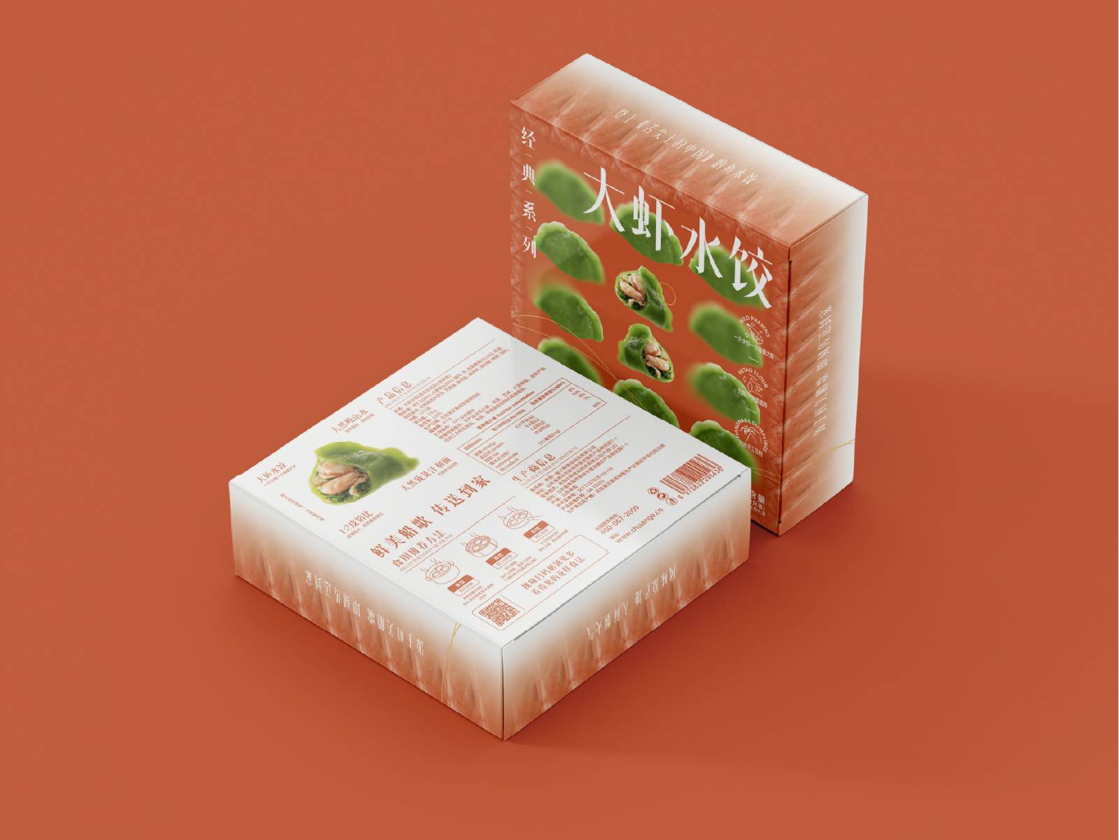
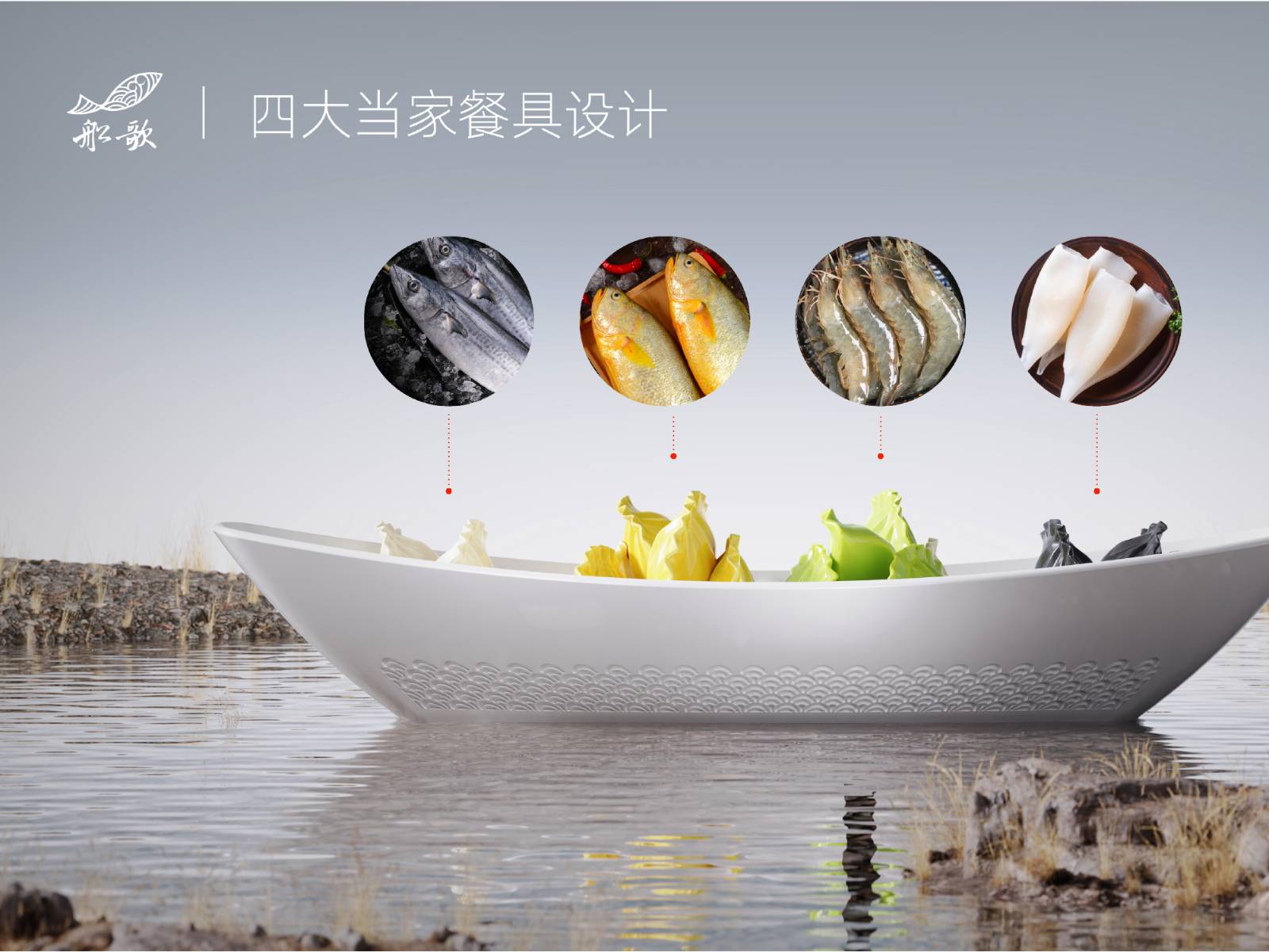
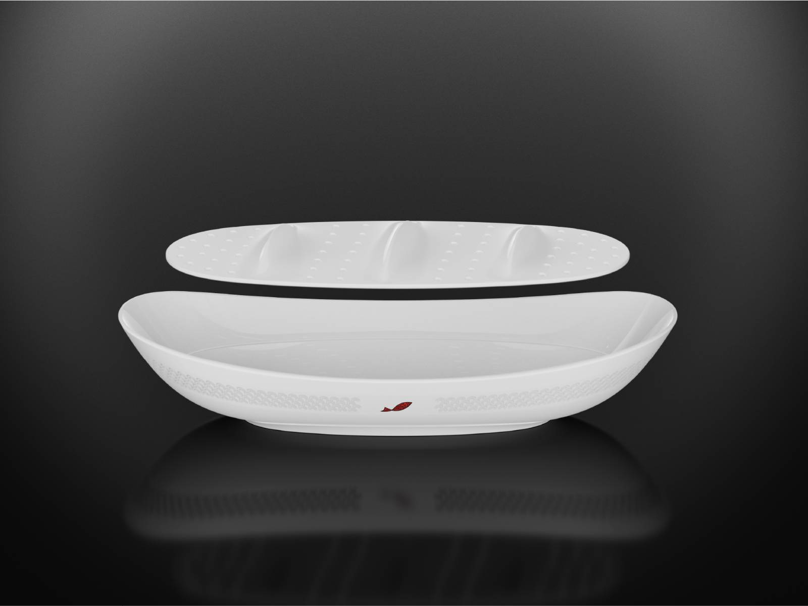
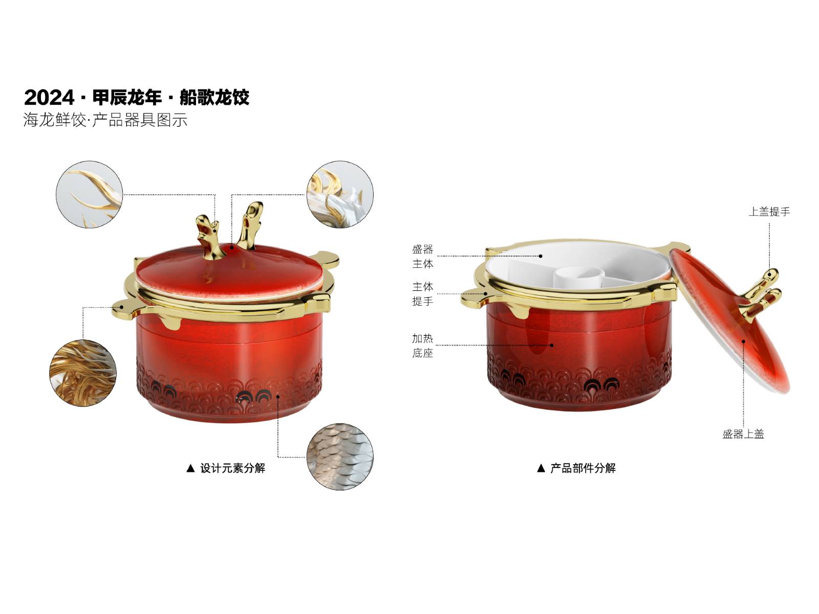
This revitalization project was developed around the core brand proposition of “authentic Qingdao cuisine and the originator of fish dumplings.” It addresses several key challenges: an aging brand image, homogenized store expressions, unclear differentiation among store formats, and the need for a more systematic brand standard. The design team restructured the brand into a scenario-based matrix, including Chuange LAB, Chuange Fresh, Chuange Banquet, and Chuange Badaguan, while delivering brand strategy refinement, a renewed visual identity system, the IP character “Yuanbao,” supporting graphics, restaurant touchpoints, shopping bags, tissues, coasters, wet wipes, posters, new dumpling packaging, tableware, and other applications.
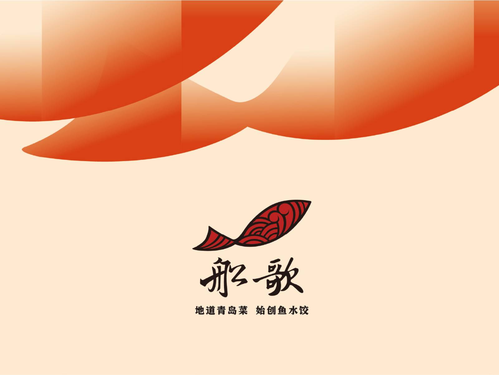
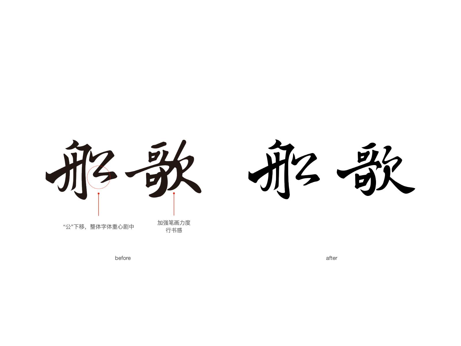
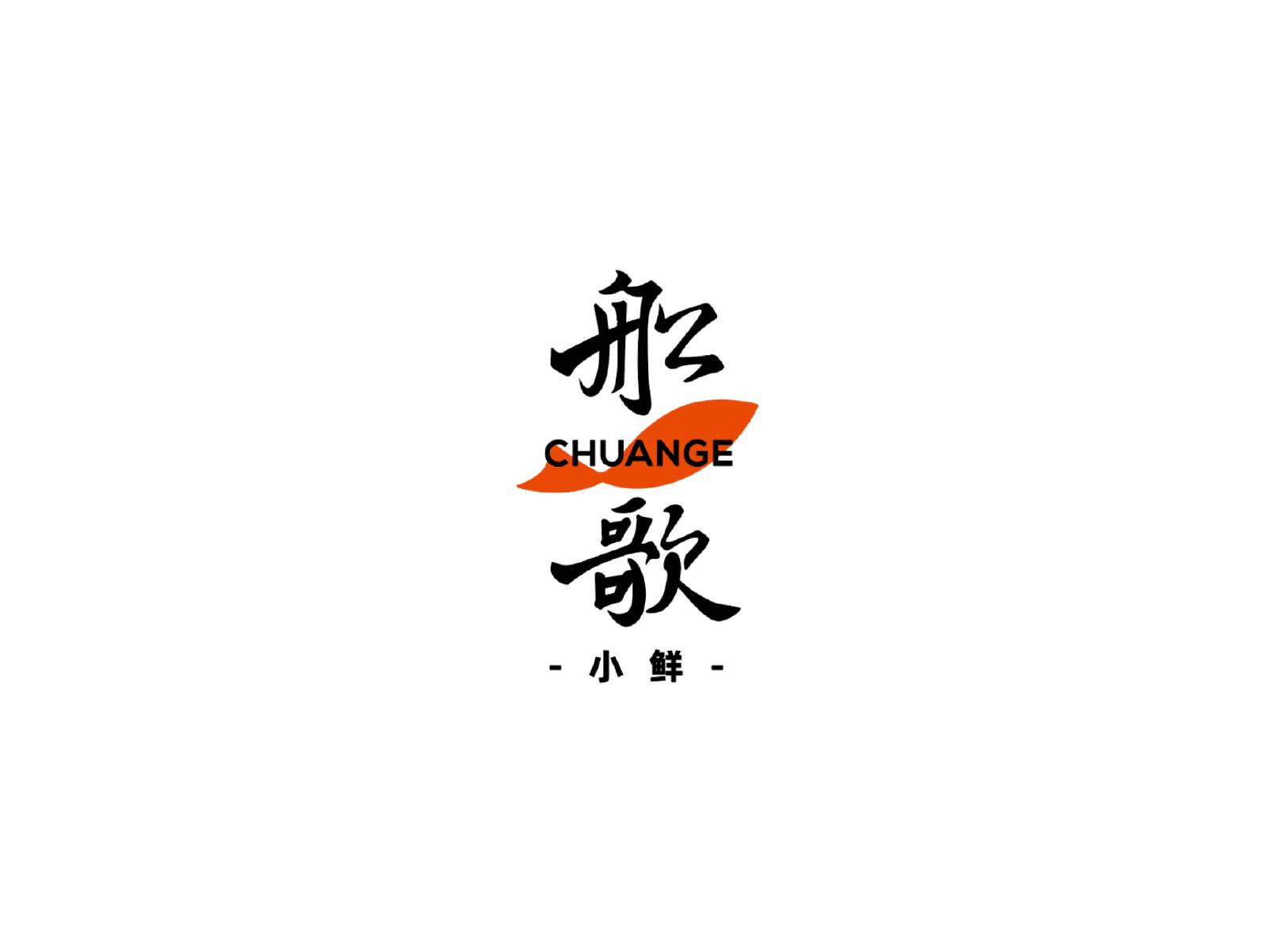
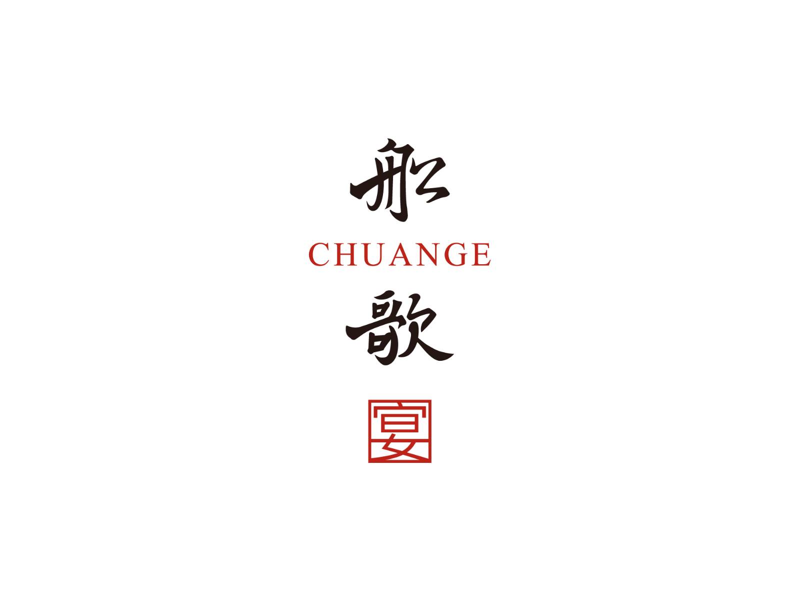
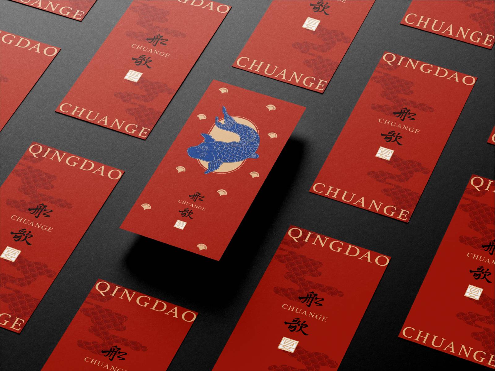
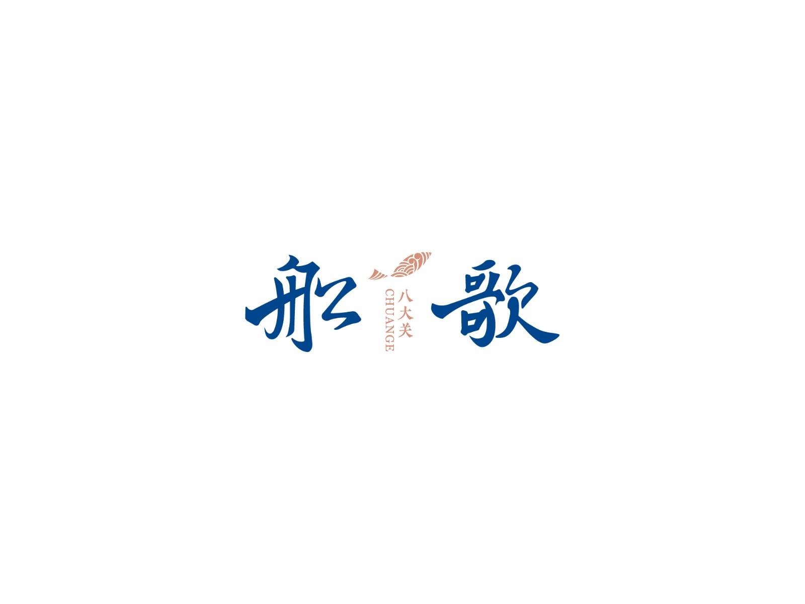
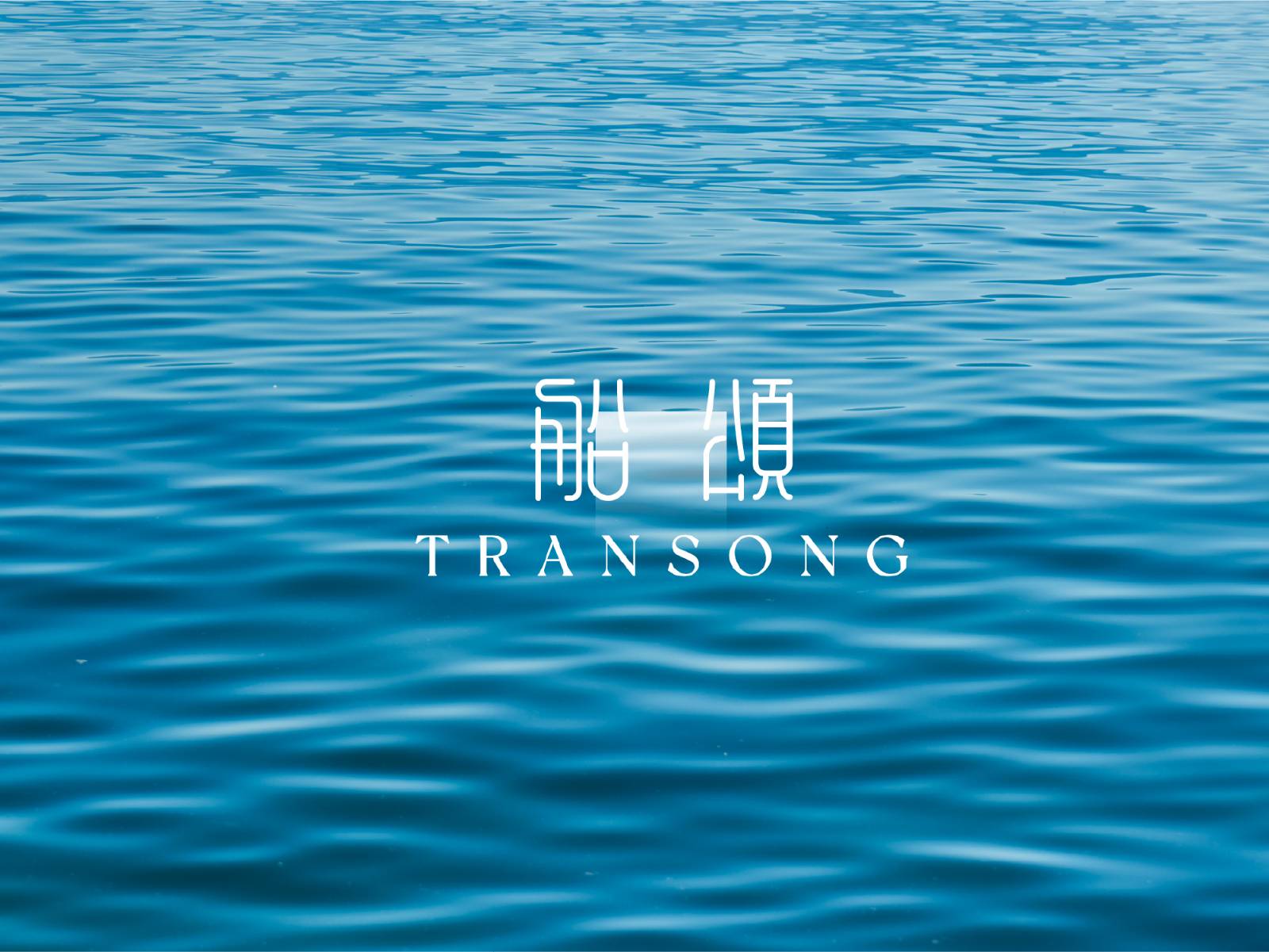
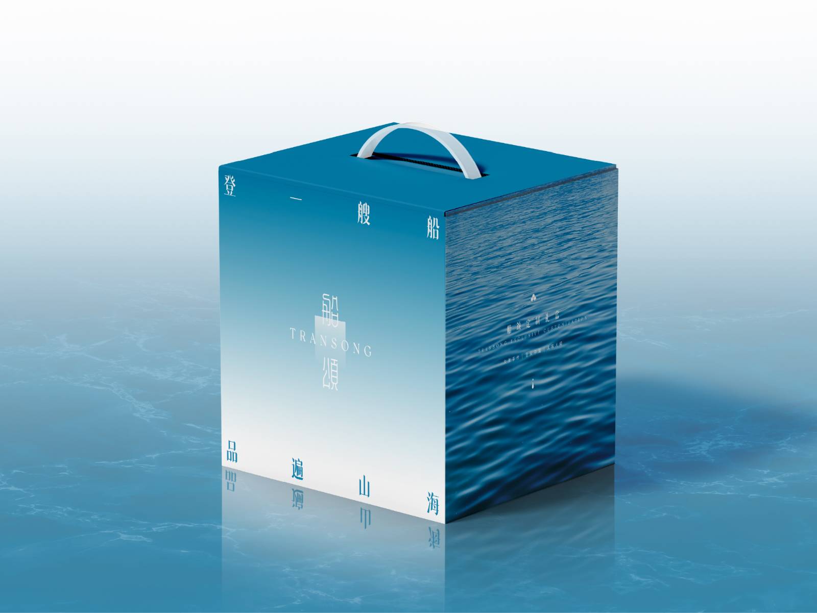
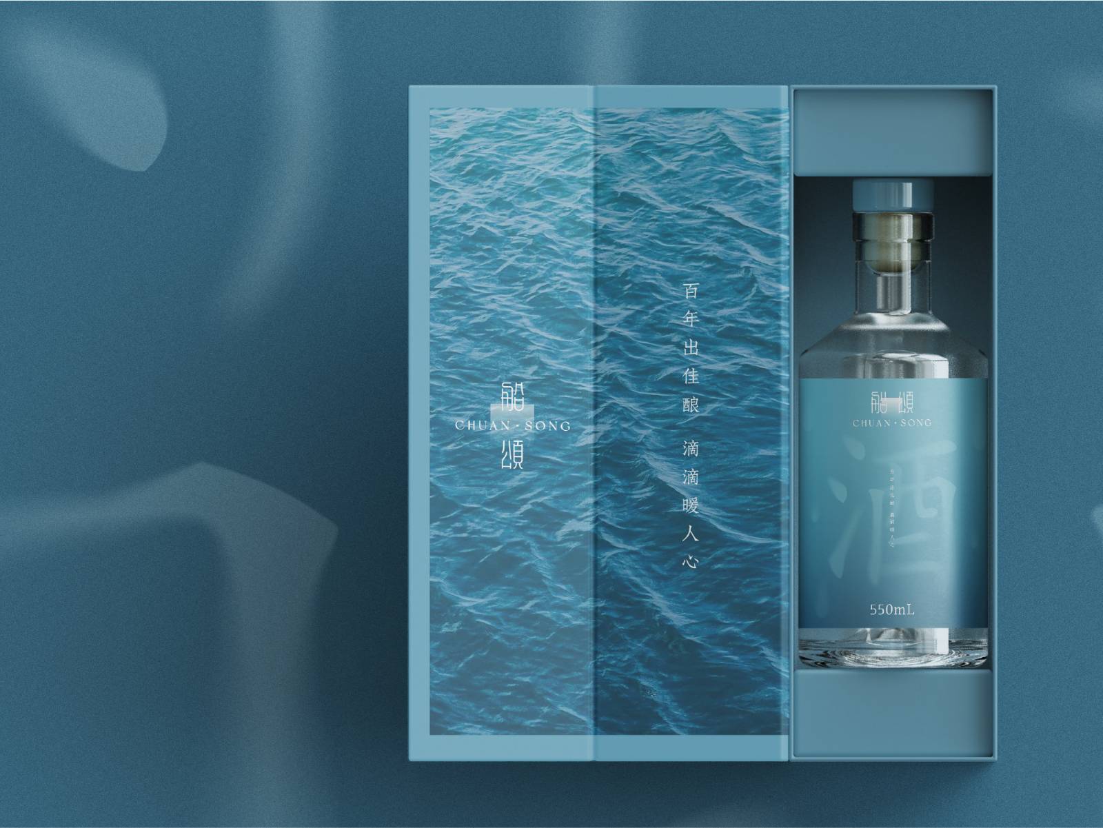
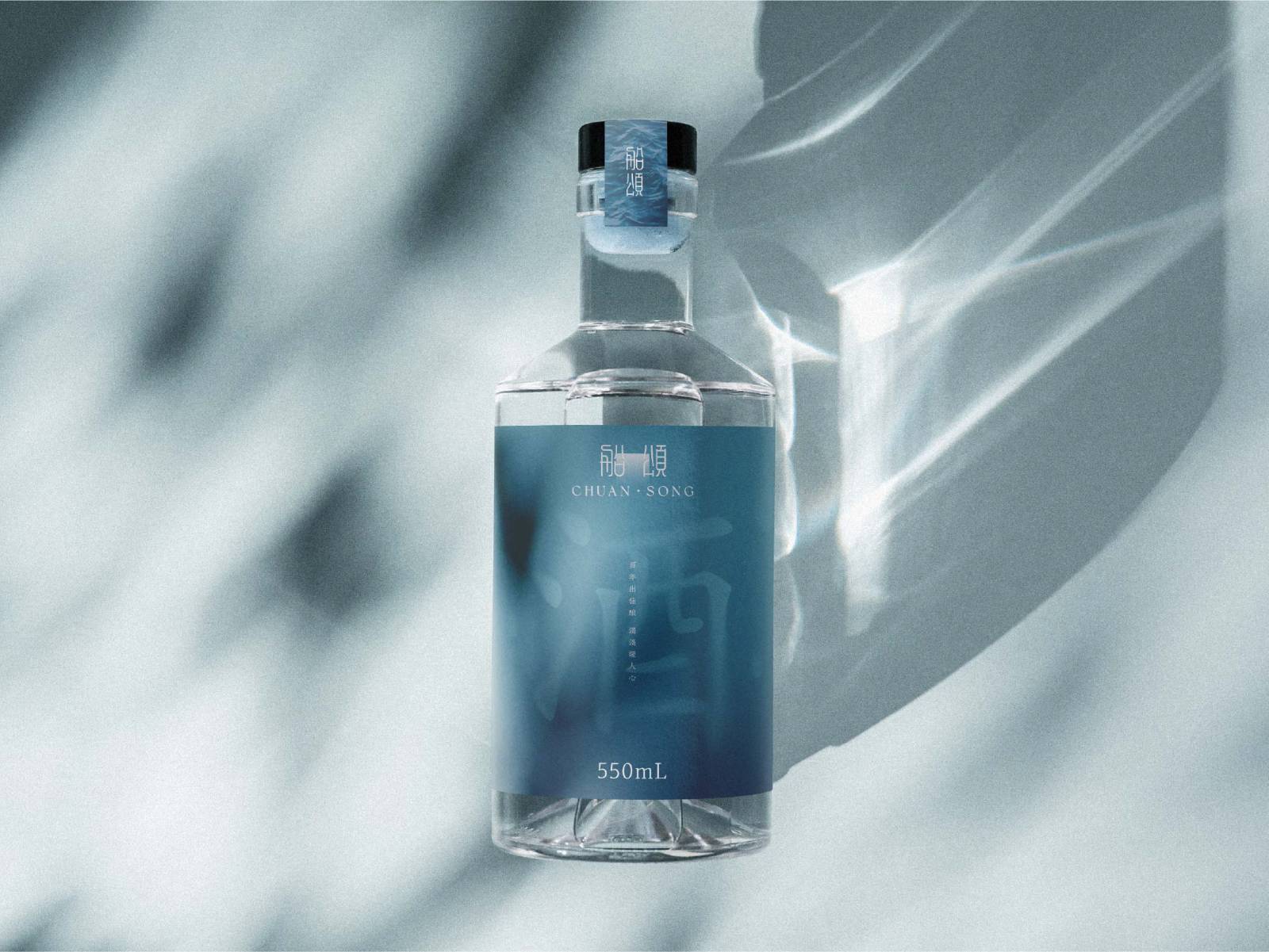
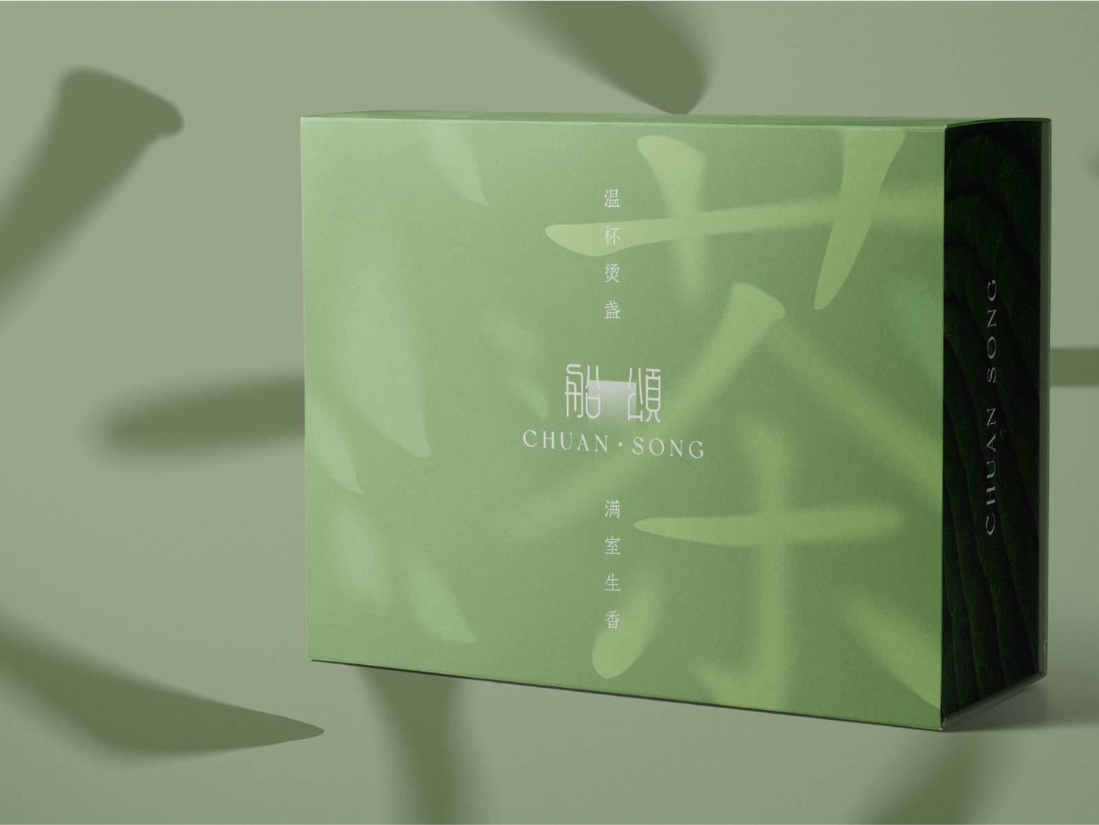
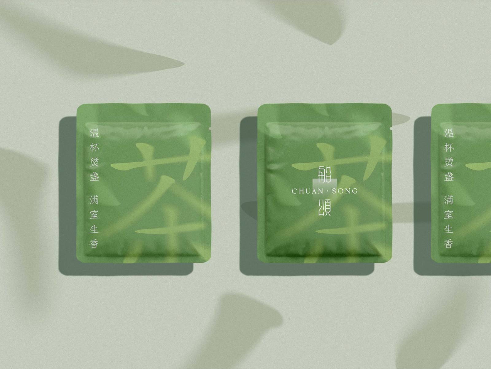
The visual strategy draws from Qingdao’s marine culture, Jiaodong’s lively food culture, and the brand’s category asset of fish dumplings. It preserves the oriental character of the calligraphic Chuange logotype while optimizing weight, rhythm, and stroke strength for stronger recognition and a more contemporary presence. At the same time, fish, scales, waves, water surfaces, smoke, banquet red, and ocean blue were transformed into a flexible visual language across Fresh, Banquet, Badaguan, and Transong product lines. The result is a complete brand upgrade system covering strategy, identity, online communication, offline experience, core recognition, and product packaging.




用户名
{{ item.email }} {{ moment(item.meta.createAt).format('YYYY-MM-DD HH:mm:ss') }}
回复:{{ item.mentioned }} {{ item.content }}
回复