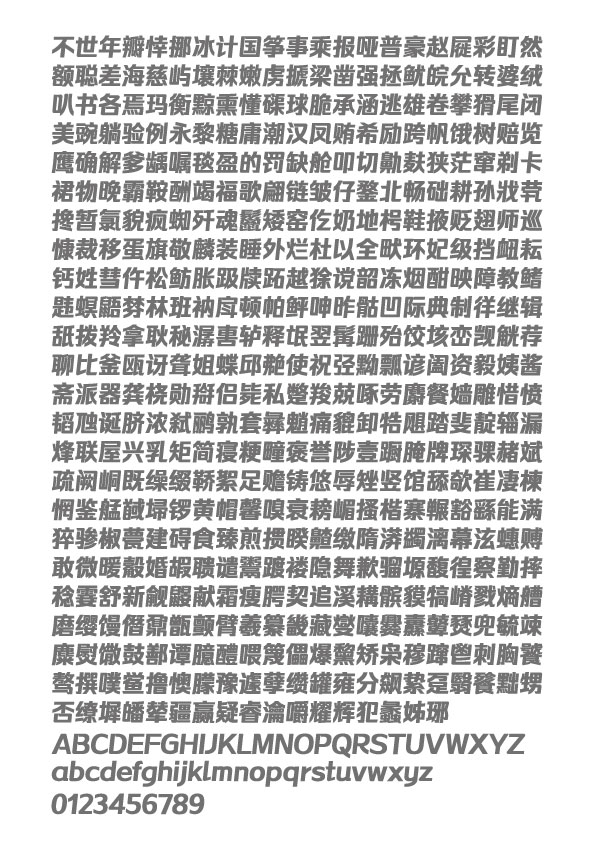
作品简述
一款始创的独立斜体文字
回顾拉丁字体的设计历程,正体字和斜体字分别独立设计是由来已久的。但汉字系统鉴于体量庞大,独立的斜体字体,在铅字时代无人企及,以至出现历史的空白;进入电脑字库时代,文字通过软件可以轻易地被拉成斜体字。然而,数字的变量所带来的结构损伤、布白失衡、笔形扭曲等负面因素,却被忽略不计了。
用户价值
在“将就”与”讲究”之间,我们选择了后者,《驰黑体》的创作,开创了汉字独立斜体的先河。这不是外延层面的“标新立异”,其真正的内涵是让《驰黑体》在排版版面中,呈现出流动的文字驿动的心,提升文字的辨识度,更有效地减少受众的阅读障碍。
商业表现
约十万家品牌公司合作使用该字体,平面设计品牌传播用。
社会影响
可复制类软件,能通过互联网,在线下载等环保方式传播。
团队组织
锐字工房:字不按古,匠心独妙!锐字工房是一家专业从事汉字字体创意设计的公司,致力于中华汉字文化的传承与创新,通过极富创意与跨界思维的字体设计赋予传统汉字新的表现形式,使字体作为视觉语言满足当代商业宣传中更直观、更有力、更具表现力的传播和表达需求。
流程方法
经过2年的开发,更新,校对,将字形的美感,艺术气息体现出来的同时,整理了字的平衡性。
达成情况
来自于汽车设计的线条感
汽车设计,伴随着时代的节拍,常态化的循序迭代,不断满足人们日益增长的审美和功能诉求。汽车风阻系数的每一次微小降低,都与外形调整设计所做出的巨大努力相关。《驰黑体》跨界植入了汽车流动感的线条,致力于提高文字的扫读效率。对于这款字体,我们给出的定位是:中性字体、科技感和人性化、与受众审美的契合度、稳整匀的平衡感以及有内涵的辨识度。《驰黑体》的设计,对于字与字之间关系的考量是近乎苛刻的,对于文字的合理布白是高度谨慎的,对于字体整体风格的拿捏是一丝不苟的。我们从一笔一划开始,就是基于斜体字的平台思维进行设计,既然是一款被锁定的斜体文字,那么,不管是用什么手段将它拉回到正体,都是不可逆的。《驰黑体》的设计语境,对接的是当下的时尚潮流和未来的用字市场,适合全媒体使用,有可能成为老款黑体字的终结者!
样张提供的是《驰黑粗体》和《驰黑细体》两款,日后有待形成共七种粗细的《驰黑体》系列字库。
Project Description
The first individual Chinese italic type
Back to the history of Latin typefaces, it’s been a long time since the roman type and the italic type were invented. Due to the substantial scale of the Chinese types, the italic type was blank until the computer age. Software boosted the development of the Chinese italic types. But a number of negative elements brought by the variables of the computer were neglected, such as the structure damage, the imbalance of the blank, and the tortuosity of the strokes.
User Value
Fortunately, we overcame these problems. The Galloping boldface is the frontier of the Chinese italic type (without roman version). More than the outward appearance, the Galloping boldface improved the fluidity in the layout and legibility, which reduced the obstacle in reading.
Business Performance
Over 100K companies have used the font in the graphic design and brand communication.
Social Impact
Reproducible software. download from the internet.
Team Structure
Reeji studio is a Chinese typeface design expert, working on the creative expression of traditional characters, which makes the types, the visual language, competent and expressive in today’s commercial world.
Reeji studio typefaces have caught the eye of a great number of brands and media, and been authorized to dozens of leading companies of all walks of life, such as Tencent, Huawei, NetEase, Lenovo, Mengniu, Anhui TV and etc.
Flow
Over 2 years development, update and proofreading, the aethetics and the balance of the structure are improved.
Project Investment
Over 2 years development and study.
Project Achievements
Inspired by the lines of auto-design
In the alternation of times, auto-design keeps catering to the growing need of public aesthetics and functions. Every tiny decrease in the drag coefficient is related to the huge effort behind the external design. We combined the flowing lines of the auto-design in the Galloping boldface to improve the scanning efficiency. We define the type as the neutrality, Hi-tech, fit-to-purpose, the great balance and legibility. When we designed the Galloping boldface, we gave a lot of thoughts to the adjacency, condensation and the overall style. Every stroke was designed for an italic type. There’s no way to be reversed to a roman type. Based on the current trend of fonts, the Galloping boldface was designed for all the media, which will hopefully be the next boldface king.


用户名
{{ item.email }} {{ moment(item.meta.createAt).format('YYYY-MM-DD HH:mm:ss') }}
回复:{{ item.mentioned }} {{ item.content }}
回复