作品简述
汉字文化博大精深,汉字中最具代表性的字体——黑体字,结构严谨中规中矩。而草书结构简省、笔画连绵,形成于汉代,是为了书写简便在隶书基础上演变出来的。狂乱中彰显优美,王羲之用的就是汉代草书。将两者之美融于一体是设计师追求的创作初衷。
用户价值
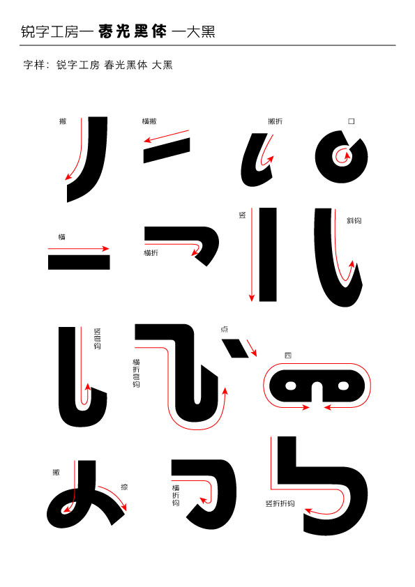
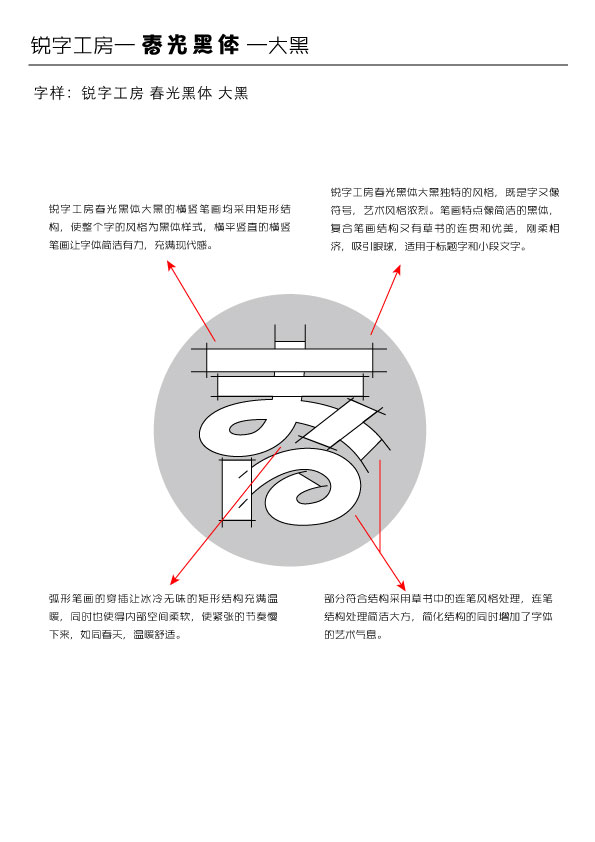
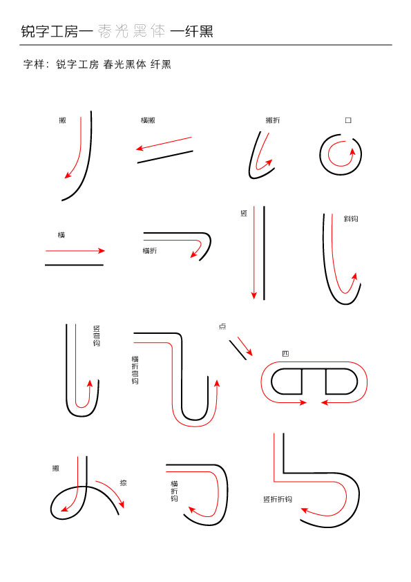
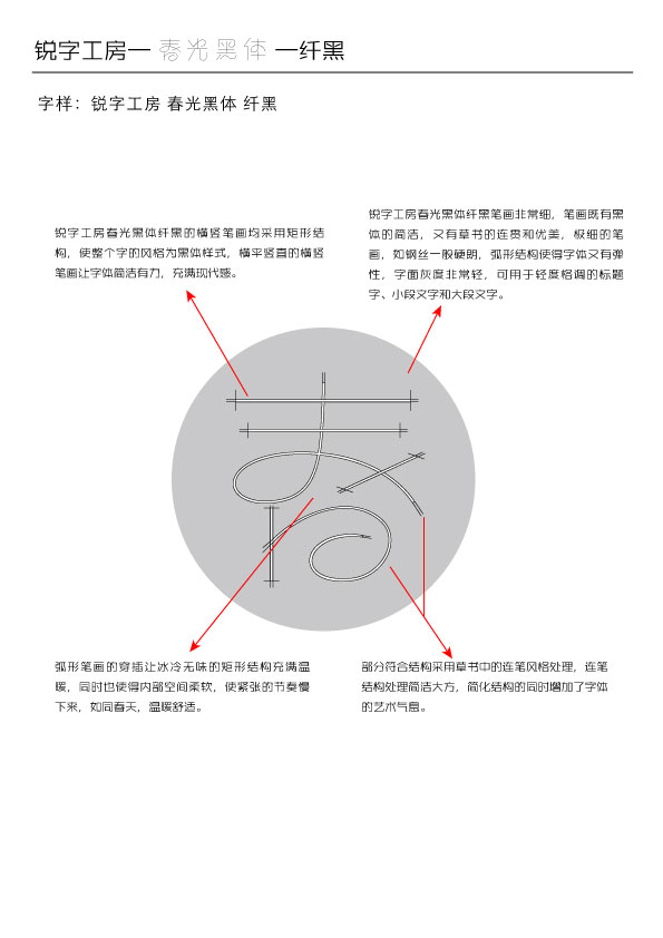
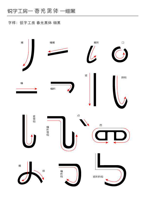
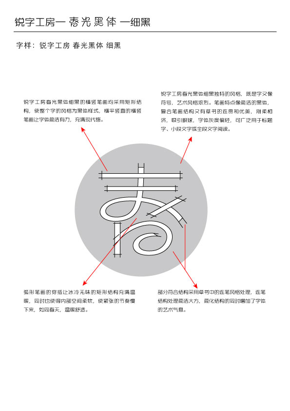
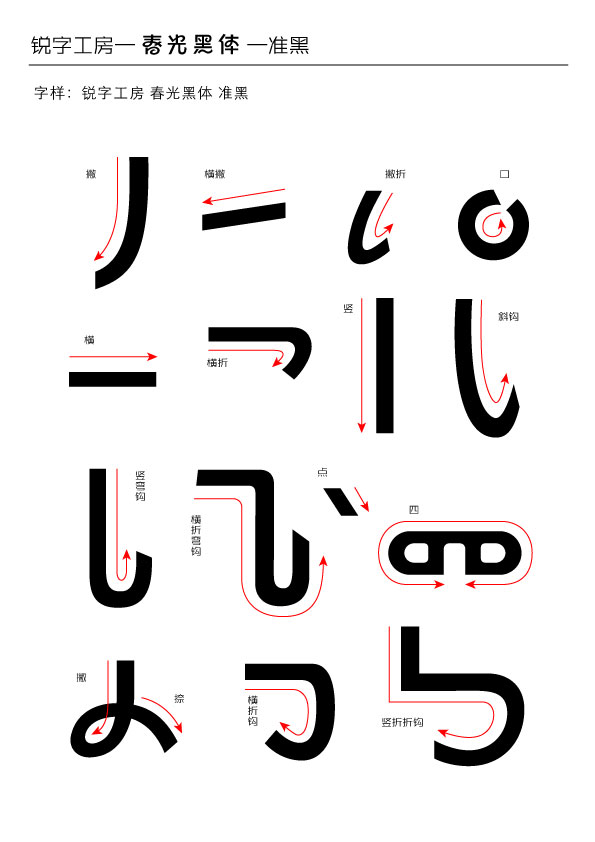
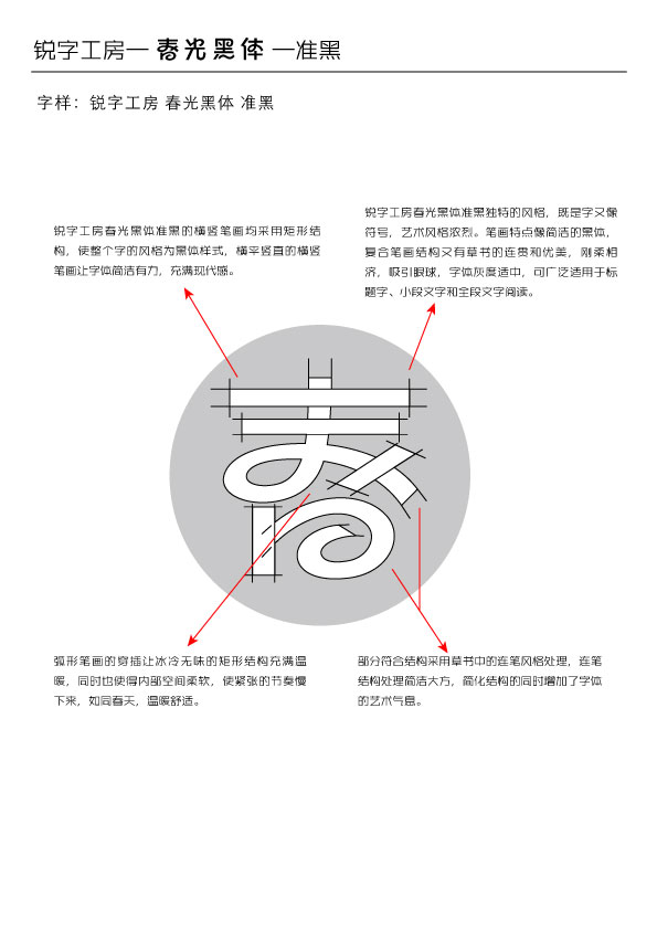
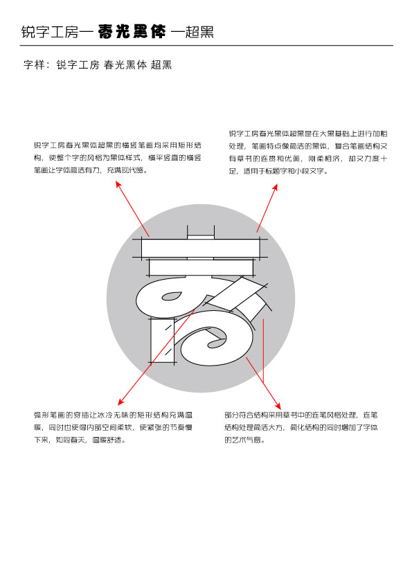
黑体字方整、粗犷、朴素、简洁、无装饰;而汉代草书字字独立,字形遍方,笔带横势 。设计师取黑体字的“方整”加上汉代草书的“势”。稳重中求得连贯变化,既要有变化又不能太过火。因此,在保证辨识度最大化的基础上,沿用黑体字的字架结构,同时在字形的偏旁部首中融入汉代草书在书写过程中的连笔感觉,这就是春光黑体字的特点。
商业表现
约十万家品牌公司合作使用该字体,平面设计品牌传播用。
社会影响
可复制类软件,能通过互联网,在线下载等环保方式传播。
团队组织
所有设计均出自李春光设计师本人之手。因三十余载的雕塑背景,设计师在不知不觉中,把雕塑力求的整体感带入到字形的变化创作中,使其在视觉上呈现结实而又有活力的表现手法。春光黑体字就像一幅图画,一座雕塑,一种视觉形式。
流程方法
经过数10个月的开发,更新,校对,将字形的美感,艺术气息体现出来的同时,整理了字的平衡性。
达成情况
汉字文化博大精深,汉字中最具代表性的字体——黑体字,结构严谨中规中矩。而草书结构简省、笔画连绵,形成于汉代,是为了书写简便在隶书基础上演变出来的。狂乱中彰显优美,王羲之用的就是汉代草书。将两者之美融于一体是设计师追求的创作初衷。因三十余载的雕塑背景,设计师在不知不觉中,把雕塑力求的整体感带入到字形的变化创作中,使其在视觉上呈现结实而又有活力的表现手法。春光黑体字就像一幅图画,一座雕塑,一种视觉形式。
Project Description
The culture of Chinese characters enjoys a storied history, in which the representative bold type font is strictly and neatly structured. While the cursive script, which was developed from the official script of Han Dynasty, is structured swiftly and flowingly.
User Value
The famous calligraphy master Wang Xizhi’s works belong to the cursive script. The designer took advantage of the “neatness” of the bold type and the “strike” of the cursive script to create a continuous change in a stable state in a perfect degree.
Business Performance
Over 100K companies have used the font in the graphic design and brand communication.
Social Impact
Reproducible software. download from the internet.
Team Structure
Designed by Li Chunguang.From his 30-year sculpting career, the designer brings the integrity of the sculpting into his design in font, which adds both vigor and firmness to his work. Chun Guang Hei is a painting and a sculpture, as well as a visual formality.
Flow
Over 10 months' development, update and proofreading, the aethetics and the balance of the structure are improved.
Project Investment
Over 10 months' development and study.
Project Achievements
The culture of Chinese characters enjoys a storied history, in which the representative bold type font is strictly and neatly structured. While the cursive script, which was developed from the official script of Han Dynasty, is structured swiftly and flowingly. The famous calligraphy master Wang Xizhi’s works belong to the cursive script. The designer took advantage of the “neatness” of the bold type and the “strike” of the cursive script to create a continuous change in a stable state in a perfect degree. From his 30-year sculpting career, the designer brings the integrity of the sculpting into his design in font, which adds both vigor and firmness to his work. Chun Guang Hei is a painting and a sculpture, as well as a visual formality.




用户名
{{ item.email }} {{ moment(item.meta.createAt).format('YYYY-MM-DD HH:mm:ss') }}
回复:{{ item.mentioned }} {{ item.content }}
回复