作品简述
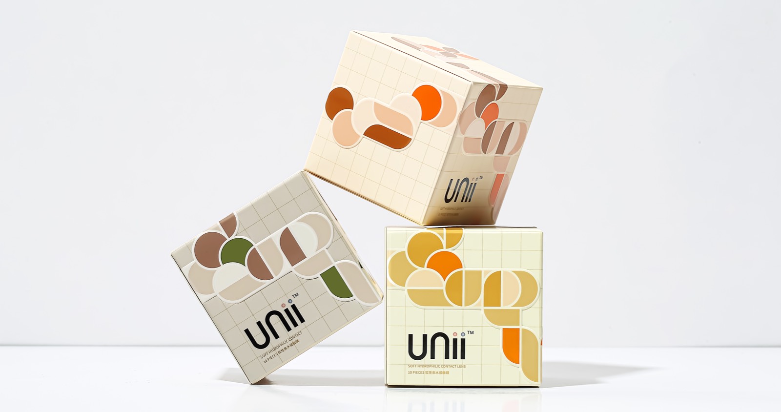
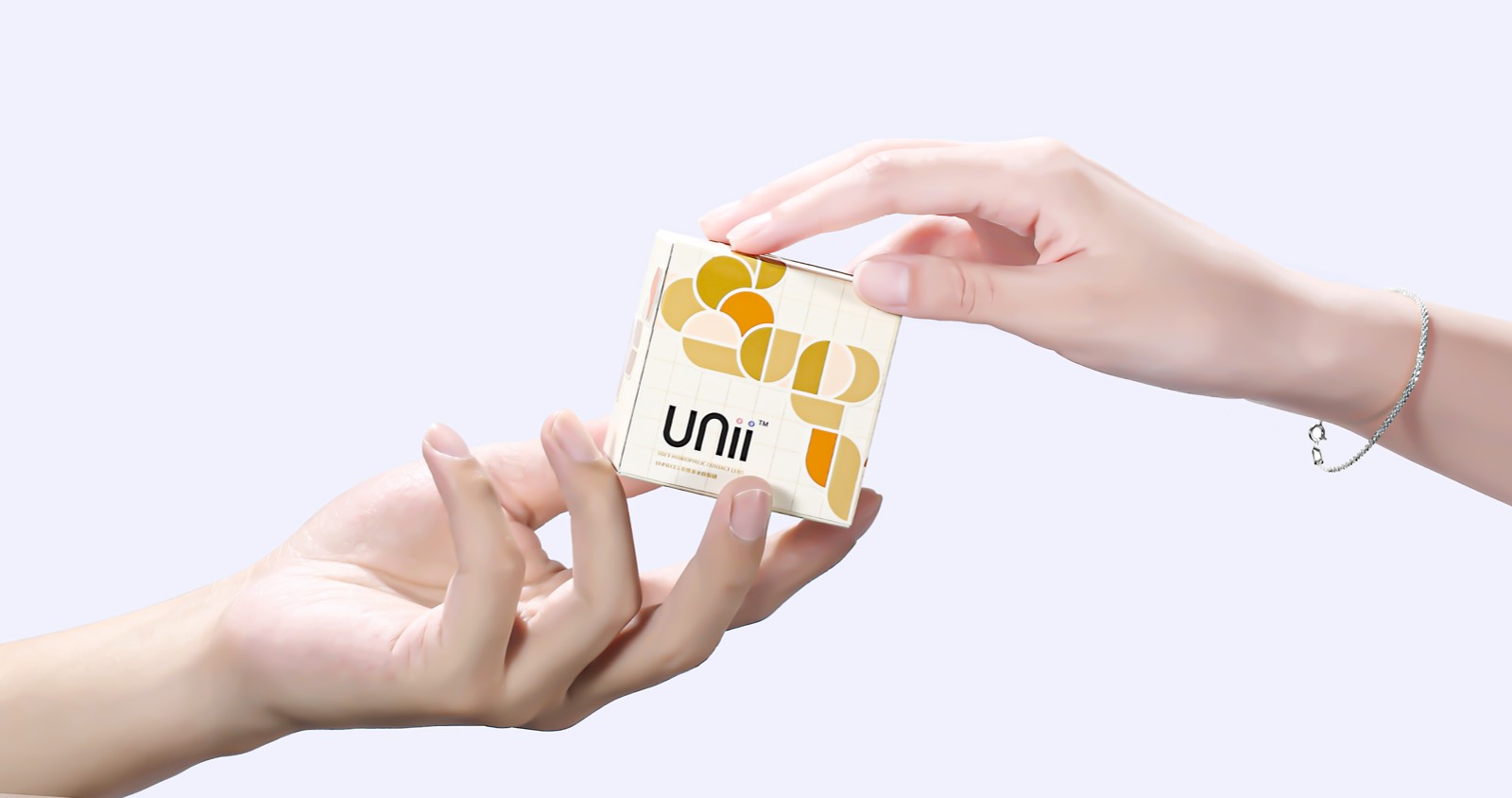
Unii取自Uni-,代表了每个鲜明而独特的个体。品牌的每个独立包装都为正方形,在有限的六个面上创造出无限的可能,传达不被定义、表达自我的品牌理念。同时,每个面自成一体而又相互呼应,照应保持个性而又不失共性的现实世界。
Unii是一个以自由、独立为态度的新锐彩色隐形眼镜品牌。该品牌将立方体——柏拉图固体(正多面体)——作为其产品的包装。Unii凝聚自我意识与生活方式,以点、线、面的紧密链接,构建理性化的品牌空间。方形元素作为Unii态度和内涵表达的载体,传达了“不被定义的自我”的品牌理念,同时具有前瞻性和独特的品牌愿景。
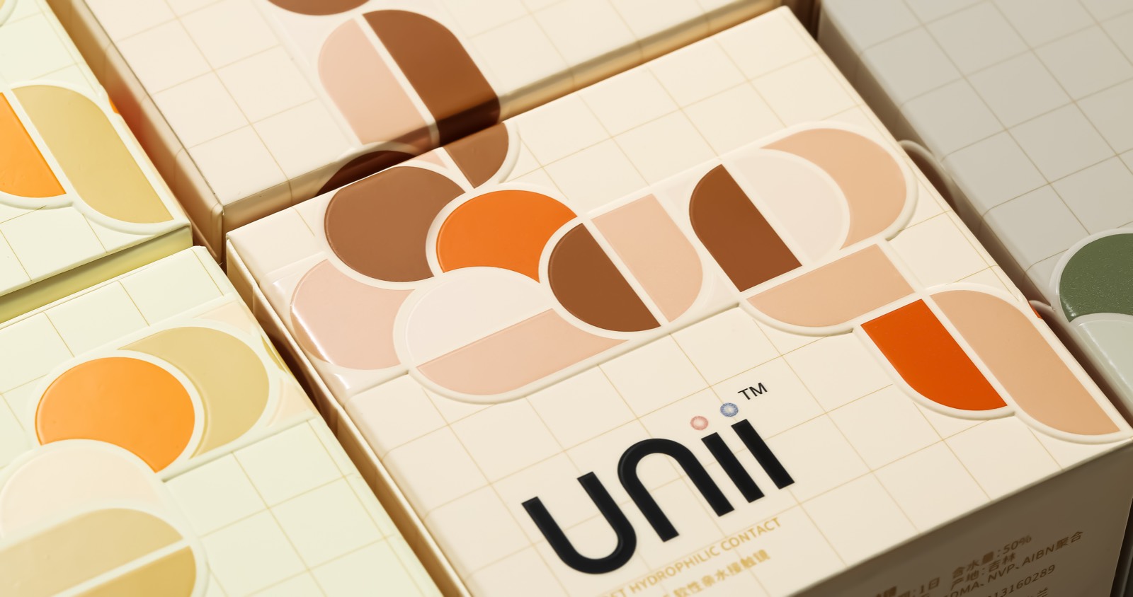
该彩色隐形眼镜的包装具有浓郁的包豪斯风格。Unii,摆脱传统的文字信息和具像的艺术形式,充分利用抽象的几何图案来打造品牌视觉识别,突出不被定义的个性概念和给用户带来的舒适的穿戴体验。
用户价值
Unii在品牌定位上与消费者建立了全新的联结,在内包装与外包装中,都进行了包装创新。我们将Unii品牌形容为一个独立的“空间”,这个“空间”是一个集品牌理念、态度、主张、情感等多维元素于一体的立方体。Unii通过在这个空间中宣扬的主张和表现的态度,与消费者建立情感连接,鼓励每一位消费者能够在不确定中探索不被定义的自我,尝试更多的可能。
因此设计团队将“空间”的概念与包装进行结合,通过柏拉图固体形式进行表达,让品牌理念与视觉系统连贯一致。
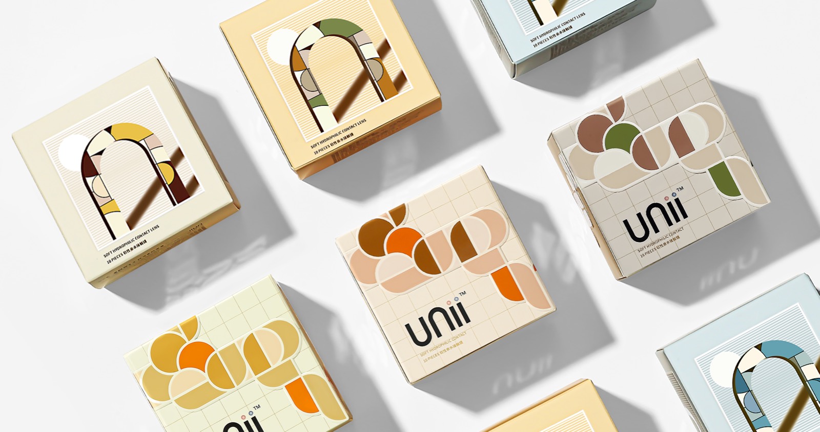
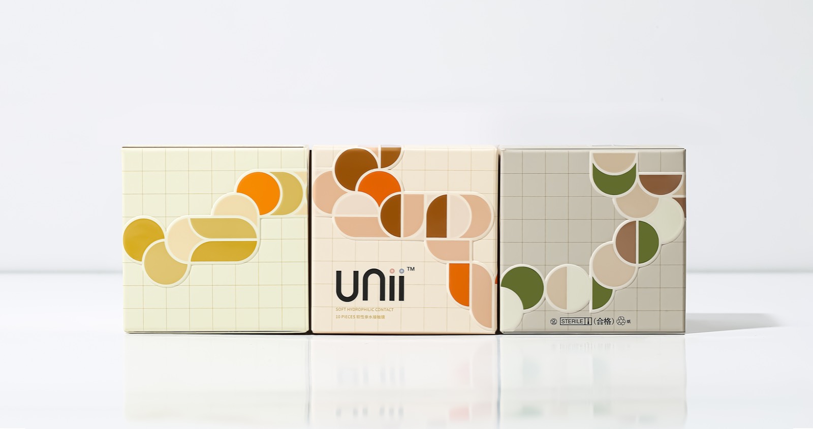
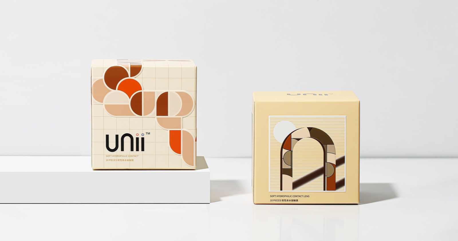
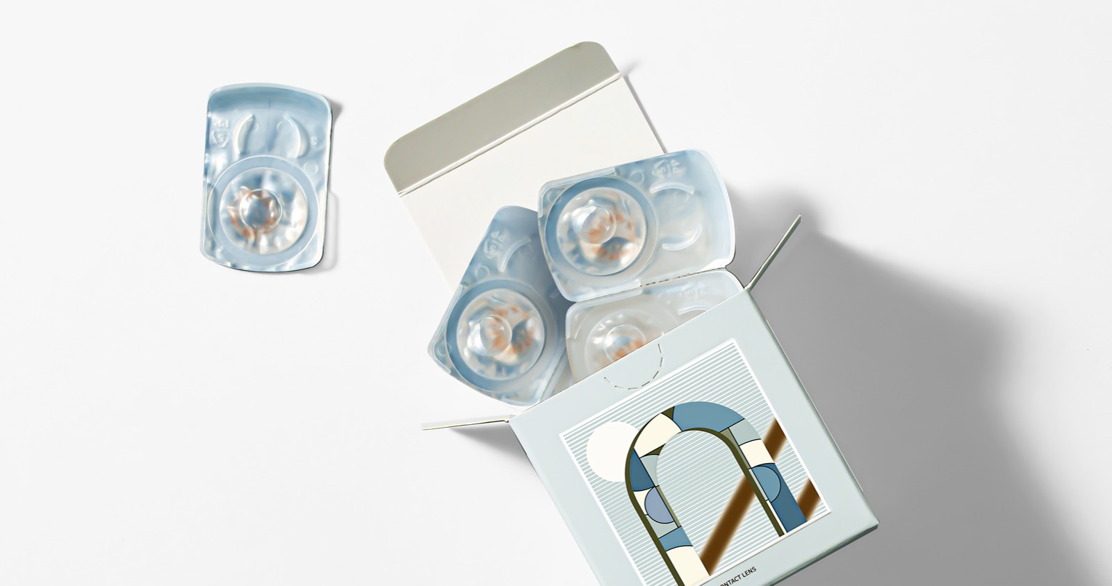
在包装设计中,设计团队将品牌定位中的“连接”与“独立”确定为品牌态度, 并据此提出了“环岛”和“逆光”这两个系列主题。每个系列的包装采用不同的造型来区分主要产品功效(含水率,透氧性等)。采用的不同配色方案也与包装内产品色彩有关,便于消费者直观理解和区分。PP材质的容器内部采用铝箔密封圈,为实现有效的无菌屏障系统。另外,包装盒的平面图案和配色与外包装也保持一致,形成了整个产品协调统一的视觉效果。
商业表现
商品一经上线,在还没有任何品牌营销策略的情况下,凭借其新颖的包装造型、包装概念、美瞳配色激起了许多年轻消费者尝新心理。上架不到一周销量破千,在一众美瞳品牌新品中领跑。消费者使用反馈好评如潮,立方体的外盒造型第一眼就从其他竞品中跳脱出来,加之其独特的视觉错位包装设计,更是让消费者对包装设计赞不绝口。博士伦的隐形眼镜舒适度及美观度则不用再赘述,一直是行业的佼佼者。因此新品Unii上线至今,势头迅猛,热度依旧不减。同时,Unii的全新包装也获得了设计界的关注和认可,已荣获2022年红点设计大奖及2022MUSE设计银奖的殊荣。
社会影响
Unii品牌的发布与推广从两方面为市场带来了价值。从品牌市场定位的角度,Unii大胆的选择了uni-的概念,传达品牌“中性”的态度。并且鼓励受众通过探索Unii“空间”的方式,发现全新的自我,找到独特而不被定义的自己。这在当下的彩色隐形眼镜品牌中独树一帜,尤其对于年轻消费群体,对其探索精神起到了鼓舞作用。其次,Unii所采用的正多面体的包装形式,不仅在形式上与品牌概念达成了一致,也在外观上进行了创新,彩色隐形眼镜市场带来了新的形象。
团队组织
Matthieu Rochette Schneider (创意总监Creative Direction)
Buyung Adyanto (平面设计师Graphic Design)
Winter Li (概念设计师Concept)
Mengting Wu (创意项目管理Project Management)
Cynthia Lv (创意项目管理Project Management)
Xiong Shao Chen (Freelancer:creative designer on backlight)
流程方法
Unii立方体的盒型设计在隐形眼镜品类是一次前所未有的创新,充分利用立体的结构传达品牌个性且不被框架束缚的态度。
环岛
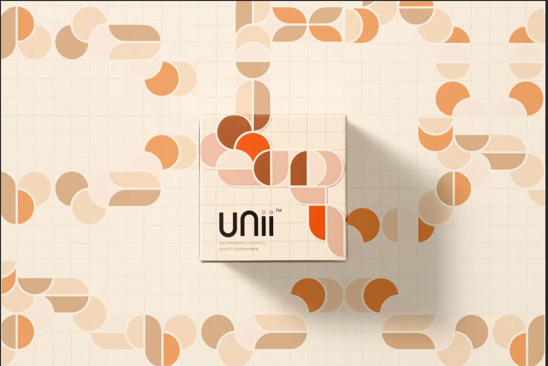
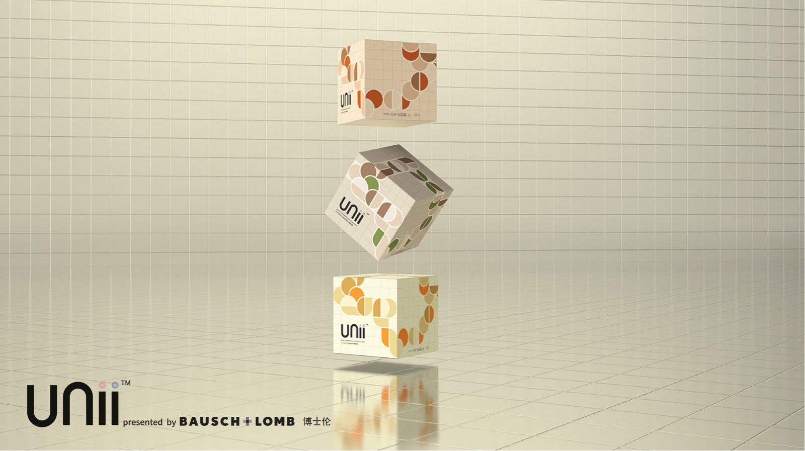
将几何形状切割、重构、联结,通过图案与色彩之间连贯、重复、呼应等手法,形成首尾相衔、前后遮挡的蜿蜒轨迹,给予用户无限延伸的感觉和乱中有序的层次感,并以此寓意不为起点与终点设下定义,不断探索从而开创新的起点。
逆光
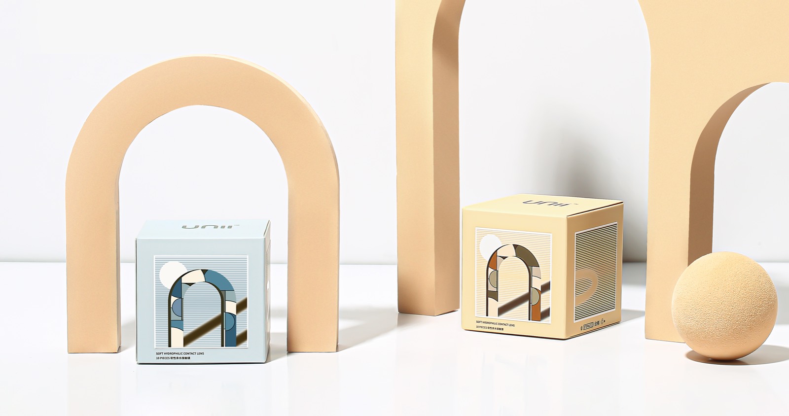
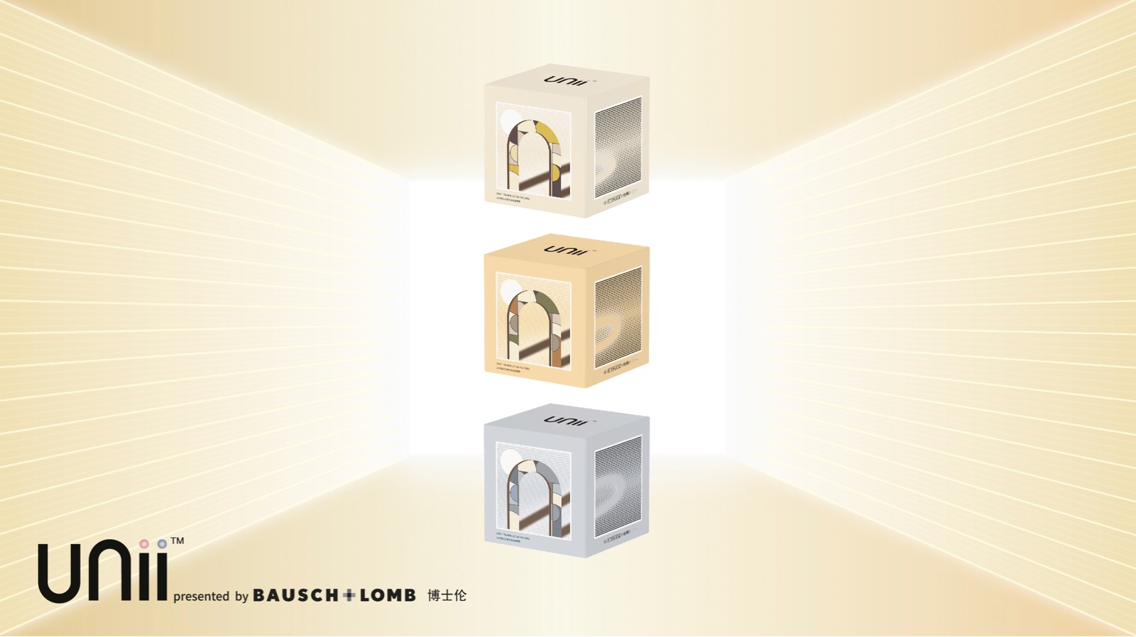
在平面立体图案中营造出明与暗的对比,通过主体视觉元素及阴影在光影下的不同呈现,寓意逆境之下仍然不受干扰、保持独立的处世态度。此外,画面旋转产生的视觉错位扩大了用户对产品的联想,赋予更多趣味。
达成情况
博士伦全新推出的新锐彩片品牌Unii和年轻一代的消费者展开了一场关于无性别思潮的对话,他们拒绝既定的规则,希望掌握自我表达的主动权。Unii看见并尊重每一个独立个体,用眼神,释放自我态度。Unii品牌拥有逆光和环岛两个系列,以无性别款式为主, 颜色集中在大地色系以及棕色系和灰色系,让女生和男生都可以无负担地配戴。花纹的设计自然不失个性,运用纳米级的印染技术和独特的设计理念,能瞬间提亮和加强眼部的感染力,搭配中性风格的服装,提升整体时尚度和风格化,以眼定装!
Project Description
Unii is taken from Uni-, which represents each distinct and unique individual. Each independent package of the brand is a square, creating unlimited possibilities on the limited six sides, conveying the brand concept of not being defined and expressing oneself. At the same time, each surface is self-contained and echoes each other, responding to the real world that maintains individuality without losing commonality.
Unii is a cutting-edge color contact lens brand with an attitude of freedom and independence. The brand takes the cube - the unique zonohedron among the Platonic Solids - as the packaging for its product. Besides, Unii condenses its self-awareness and lifestyle to construct a brand space featured by the close and rational connection among the points, lines and planes. And the square elements function as the carrier of Unii's attitudes and connotation, conveying the brand concept of self-expression without being defined, as well as the forward-looking and unique brand vision.
The packaging for color contact lens is featured by a strong Bauhaus style. Shedding traditional text information and the figurative art form, Unii makes full use of abstract geometric patterns to create the brand visual identity, which highlights the concept of undefined personality and the comfortable wear experience it brings to users.
User Value
Unii has established a new connection with consumers in terms of brand positioning and has carried out innovations in both inner and outer packaging. We describe the Unii brand as an independent "space", which is a cube that integrates multi-dimensional elements such as brand concept, attitude, proposition, and emotion. Unii establishes an emotional connection with consumers through the propositions and attitudes promoted in this space, encourage every consumer to explore the undefined self in the midst of uncertainty and try more possibilities.
Therefore, the design team combined the "space" concept with the packaging, expressing it in the form of a Platonic solid, so that the brand concept and the visual system are consistent.
The packaging for each series utilizes different styling to distinguish the main product efficacy (moisture content, oxygen permeability, etc.). Diverse color schemes adopted are also related with the inner color contact lens, facilitating the intuitive understanding and distinguishing of the product. The PP containers inside utilize aluminum foil sealing rings to realize the effective sterile barrier system. Besides, the graphics and color schemes of the containers are consistent with the outer packaging, forming a coordinated and unified visual effect of the whole product.
Business Performance
When the product was launched, without any brand marketing promotion, the new series still inspired many young consumers to try with its novel packaging shape, concept and colors.
Less than a week after its launch, it has been sold more than 1,000 pcs, The sales volume exceeded 1,000 in less than a week after it was put on the shelves, leading the way in new color contact lenses
The feedback from consumers is highly praised. The outer box shape of the cube jumps out from other competitive products at the first glance, and its unique visual packaging design makes consumers full of praise for the packaging design.
The comfort and beauty of contact lenses from Bausch + Lomb is needless to say, it has always been a leader in the industry. Therefore, since the launch of the new product Unii, the momentum has been rapid and the popularity has not diminished.
At the same time, Unii's new packaging has also won the attention and recognition of the design industry. It has won the 2022 Red Dot Design Award and the 2022 MUSE Design Silver Award.
Social Impact
The release and promotion of the Unii brand has brought value to the market from two aspects. From the perspective of brand market positioning, Unii boldly chose the concept of uni- to convey the brand's "unisex" attitude. Encourage the audience to discover a new self by exploring the "space" of Unii, and find a unique and undefined self. This is unique among the current color contact lens brands, especially for young consumer groups, which has inspired their spirit of exploration. Secondly, the packaging form of regular polyhedron adopted by Unii not only echoes with the brand concept in form, but also innovates in appearance, bringing a new image to the color contact lens market.
Team Structure
Matthieu Rochette Schneider (Creative Direction)
Buyung Adyanto (Graphic Design)
Winter Li (Concept)
Mengting Wu (Project Management)
Cynthia Lv (Project Management)
Xiong Shao Chen (Freelancer:creative designer on backlight)
Flow
The cubic box-shaped design of Unii is an unprecedented innovation in the category of contact lenses, making full use of the three-dimensional structure to convey the brand's personality without being bound by the frame.
Roundabout
Cut, reconstructed and connected, the geometric patterns form an end-to-end winding trajectory with overlapping color blocks, by means of the coherence, repetition and echo of patterns and colors. Thereby, the packaging brings about an unlimited sense of extension and an orderly hierarchy in the disorder. Accordingly, it implies shedding the fixed starting and ending points, and keeping exploring for a brand-new starting point.
Backlight
On the planar face is the three-dimensional pattern showing the contrast between light and dark. The main visual element and its shadow vary with different lights and shadows, implying the philosophy of life - remaining undisturbed and independent even in adversity. In addition, the visual dislocation generated by the rotation of the faces enriches users' association with the product and brings about more fun.
Project Achievements
Bausch + Lomb's new cutting-edge color contact lens brand Unii has launched a dialogue about gender-free thoughts with the younger generation of consumers. They reject the established rules and hope to take the initiative in self-expression. Unii respects and encourages every independent individual to release self-attitude with their eyes. The Unii brand has two gender-neutral style series of products: backlight and roundabout, the colors are concentrated in earth tones, browns and grays, the design of the pattern is natural without losing the personality, so that girls and boys can wear them without burden. Using nano-level printing and dyeing technology, it can instantly brighten and strengthen the appeal of the eyes. Easily matching with neutral style clothing to enhance the overall fashion and style. Shining with your eyes!




用户名
{{ item.email }} {{ moment(item.meta.createAt).format('YYYY-MM-DD HH:mm:ss') }}
回复:{{ item.mentioned }} {{ item.content }}
回复